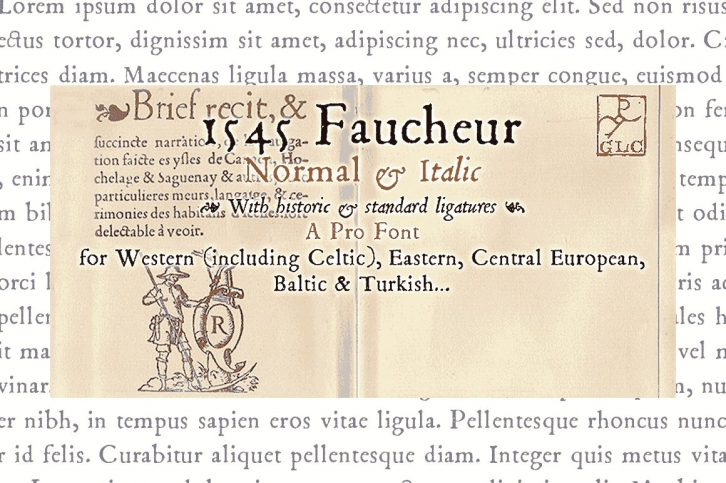

This family was created inspired from the set of fontface used in Paris by Ponce Rosset, aka "Faucheur", to print the relation of the second travel to Canada by Jacques Cartier, first edition, in 1545. It is a "Garaldic" set, the punch cutter is unknown, certainly it was not Garamond himself. In our two styles (Normal & Italic), fontface, kernings and spaces are scrupulously the same as in the original. This Pro font is covering Western, Eastern and Central European languages (including Celtic) Baltic and Turkish, with standard and "s long" ligatures in each of the two styles.
