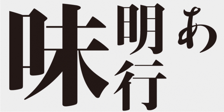
Although Ajimin has the flavor of hot metal type, it is not intended to be a revival, but a new typeface for display purposes. Like Bodoni, its vertical strokes are clear and heavy and its horizontal strokes are precise and thin. Its elements possess strength and stability.
Ajimin Modern’s elements are more sharply designed than those of Ajimin – the start and finish of vertical strokes are lowered for increased sharpness, and the horizontal strokes are cut vertically at the start and are thinner with a uniform width. Ajimin Modern is a sharp and elegant Mincho-style typeface.
This typeface is designed to be used in larger type sizes (for posters, for example), although it’s legible in smaller sizes. As the type size increases, the elegance of each stroke element becomes more visible.
A typeface based on the style of Fujiwara-no Yukinari, a writing master in the 10–11th century, was first released in 1984, as one of the Ajioka Shintaro Kana Series. I redesigned it for the first time in thirty years to create this Ajimin Modern Gyo/EB.
Fujiwara-no Yukinari was one of the “San-seki†writing masters in the Heian period (in the 8–12th Century). He contributed greatly to the establishment of the Japanese style “Shodo†calligraphy and the perfection of writing in kana characters. Yukinari started the “Sesonji-ryu†school of calligraphy, from which various schools (such as the Shouren-in-ryu, Awata-ryu and Oie-ryu schools) developed.
The Edo Shogunate adopted the style of the Oie-ryu school as its official handwriting style, it was taught at “Terakoya†schools for children, and it widely disseminated to the public. The Kantei-ryu style, used for Kabuki theaters, and the Yose-moji style, used for vaudeville theaters, were also derived from the Oie-ryu style. In the Meiji period (1868–1912), this style affected the typeface designs of the Tokyo Tshukiji Type Foundry. The Oie-ryu style can be said to be the origin of Japanese styles of writing and calligraphy.
This font includes top 1,000 kanji characters chosen from character frequency tables made by newspaper companies, publishing houses and linguistic research institutes, plus 206 kana characters and punctuation marks.
Ajimin has the flavor of hot metal type and, like Bodoni, its vertical strokes are clear and heavy and its horizontal strokes are precise and thin. Its elements possess strength and stability. Ajimin is a unique Mincho-style display typeface. Ajimin Modern’s elements are more sharply designed, but that sharpness is balanced by the richness and elegance of the design. Ajimin’s biggest feature is its 10 kana variations, ranging from running-hand-like designs, to revivals of designs from the age of hot metal type, to modern style kana. These variations make Ajimin useful for a wide range of purposes.
Supported languages: German, Spanish, Dutch, English, Polish, Russian, French, Czech, Swedish, Portuguese, Catalan, Italian, Slovenian, Maltese, Arabic, Devanagari, Greek, Gujarati, Gurmukhi, Hebrew, Chinese (hk), Japanese, Korean, Tamil, Chinese (Traditional), Chinese (Simplified), Turkish, Hungarian, Vietnamese, Bengali, Kannada, Cherokee, Thai, Armenian, Belarusian, Danish, Macedonian, Ukrainian, Norwegian, Serbian, Telugu, Malayalam, IPA, Latvian, Chinese Pinyin, Finnish, Filipino, Malay, Croatian, Kazakh, Romanian, Persian, Indonesian, Slovak, Hindi
File Size: 11.74 MB
Release date: April 5, 2021
You can use this font for:
- Design projects: create images or vector artwork, including logos
- Website publishing: create a Web Project to add any font from our service to your website
- PDFs: embed fonts in PDFs for viewing and printing
- Video and broadcast: use fonts to create in-house or commercial video content and more
- The fonts are designed to work on MacOS (Apple) and Windows (Microsoft)


