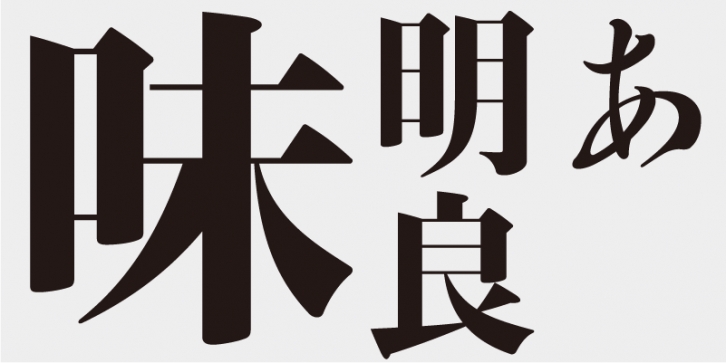
Although Ajimin has the flavor of hot metal type, it is not intended to be a revival, but a new typeface for display purposes. Like Bodoni, its vertical strokes are clear and heavy and its horizontal strokes are precise and thin. Its elements possess strength and stability.
Ajimin Modern’s elements are more sharply designed than those of Ajimin – the start and finish of vertical strokes are lowered for increased sharpness, and the horizontal strokes are cut vertically at the start and are thinner with a uniform width. Ajimin Modern is a sharp and elegant Mincho-style typeface.
This typeface is designed to be used in larger type sizes (for posters, for example), although it’s legible in smaller sizes. As the type size increases, the elegance of each stroke element becomes more visible.
Ryokan was a Zen monk from the late Edo period (1603–1868). He created highly regarded calligraphic works displaying a humane and free-form quality. His calligraphy was based on the tradition of masters such Kaiso (Huaisu) from the Tang Dynasty in China.
The Ryokan family in the Ajioka Shintaro Kana Series is based on the structure of Ryokan’s letter forms. The typeface is characterized by unique, yet authentic, kana character shapes based on the tradition of Japanese calligraphy. However, not all kana characters used today are found in the existing works of Ryokan, because many variations of kana characters (“Hentai-ganaâ€) with different glyph styles were used in those days. So, I designed kana characters by referencing multiple variations from Ryokan’s work. For Ajimin Modern Ryo/EB font, the kana characters of the Ryokan series we redesigned for the first time in thirty years to fit the style of Ajimin.
This font includes top 1,000 kanji characters chosen from character frequency tables made by newspaper companies, publishing houses and linguistic research institutes, plus 206 kana characters and punctuation marks.
Ajimin has the flavor of hot metal type and, like Bodoni, its vertical strokes are clear and heavy and its horizontal strokes are precise and thin. Its elements possess strength and stability. Ajimin is a unique Mincho-style display typeface. Ajimin Modern’s elements are more sharply designed, but that sharpness is balanced by the richness and elegance of the design. Ajimin’s biggest feature is its 10 kana variations, ranging from running-hand-like designs, to revivals of designs from the age of hot metal type, to modern style kana. These variations make Ajimin useful for a wide range of purposes.
Supported languages: German, Spanish, Dutch, English, Polish, Russian, French, Czech, Swedish, Portuguese, Catalan, Italian, Slovenian, Maltese, Arabic, Devanagari, Greek, Gujarati, Gurmukhi, Hebrew, Chinese (hk), Japanese, Korean, Tamil, Chinese (Traditional), Chinese (Simplified), Turkish, Hungarian, Vietnamese, Bengali, Kannada, Cherokee, Thai, Armenian, Belarusian, Danish, Macedonian, Ukrainian, Norwegian, Serbian, Telugu, Malayalam, IPA, Latvian, Chinese Pinyin, Finnish, Filipino, Malay, Croatian, Kazakh, Romanian, Persian, Indonesian, Slovak, Hindi
File Size: 18.2 MB
Release date: April 5, 2021
You can use this font for:
- Design projects: create images or vector artwork, including logos
- Website publishing: create a Web Project to add any font from our service to your website
- PDFs: embed fonts in PDFs for viewing and printing
- Video and broadcast: use fonts to create in-house or commercial video content and more
- The fonts are designed to work on MacOS (Apple) and Windows (Microsoft)


