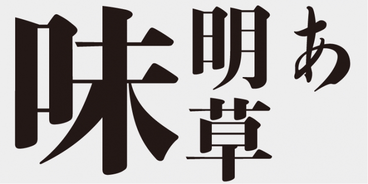
Although Ajimin has the flavor of hot metal type, it is not intended to be a revival, but a new typeface for display purposes. Like Bodoni, its vertical strokes are clear and heavy and its horizontal strokes are precise and thin. Its elements possess strength and stability.
This typeface is designed to be used in larger type sizes (for posters, for example), although it’s legible in smaller sizes. As the type size increases, the elegance of each stroke element becomes more visible.
Onono Toufu, Fujiwara-no Sukemasa, and Fujiwara-no Yukinari were calligraphy masters of the middle Heian period. The three were called “San-seki and they heralded a golden age of Japanese kana calligraphy, which continues to be influential today.
Ajimin’s hiragana and katakana characters were derived from Manyo-gana (kanji, Chinese ideographic characters). The design of these characters transforms the cursive (sou-sho) variations and simplifies strokes.
Ajimin So/EB does not have Mincho-style kana characters, but instead has a set of kana characters named “Sou†(after the “Sou-no-kana†style), which retain the quality of an older cursive brush-script style.
It may seem as if the Mincho-style letter forms are radically stylized, but in fact, the shapes are not far from those of brush-script letters. Instead, it is the kana characters included in a “Regular†style brush-script typeface that do not fit well, because of the excessive stylization in the typographic processes. If you typeset something, this becomes apparent.
This font includes top 1,000 kanji characters chosen from character frequency tables made by newspaper companies, publishing houses and linguistic research institutes, plus 206 kana characters and punctuation marks.
Ajimin has the flavor of hot metal type and, like Bodoni, its vertical strokes are clear and heavy and its horizontal strokes are precise and thin. Its elements possess strength and stability. Ajimin is a unique Mincho-style display typeface. Ajimin Modern’s elements are more sharply designed, but that sharpness is balanced by the richness and elegance of the design. Ajimin’s biggest feature is its 10 kana variations, ranging from running-hand-like designs, to revivals of designs from the age of hot metal type, to modern style kana. These variations make Ajimin useful for a wide range of purposes.
Supported languages: German, Spanish, Dutch, English, Polish, Russian, French, Czech, Swedish, Portuguese, Catalan, Italian, Slovenian, Maltese, Arabic, Devanagari, Greek, Gujarati, Gurmukhi, Hebrew, Chinese (hk), Japanese, Korean, Tamil, Chinese (Traditional), Chinese (Simplified), Turkish, Hungarian, Vietnamese, Bengali, Kannada, Cherokee, Thai, Armenian, Belarusian, Danish, Macedonian, Ukrainian, Norwegian, Serbian, Telugu, Malayalam, IPA, Latvian, Chinese Pinyin, Finnish, Filipino, Malay, Croatian, Kazakh, Romanian, Persian, Indonesian, Slovak, Hindi
File Size: 19.53 MB
Release date: April 5, 2021
You can use this font for:
- Design projects: create images or vector artwork, including logos
- Website publishing: create a Web Project to add any font from our service to your website
- PDFs: embed fonts in PDFs for viewing and printing
- Video and broadcast: use fonts to create in-house or commercial video content and more
- The fonts are designed to work on MacOS (Apple) and Windows (Microsoft)


