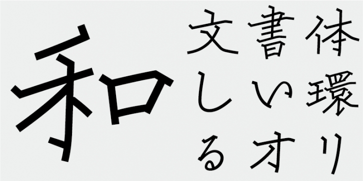
Kai is a kaisho-style (kaishu, regular script) typeface characterized by glyph structures with a dignified and masculine look.
The typeface has linear structures deliberately designed to retain visual softness. The kana characters are a redesign of the Kodoken Shincho-tai typeface.
Each character has a beautiful letter form and appearance, with its letter form typically enclosed in a circle. This typeface follows the design principle of inscribing the type body in a circle regardless of the aspect ratio of the glyph shape. As each glyph has a consistent optical center of gravity, the composed text is beautiful.
For example, when constrained in a square shape, the glyph structure of characters such as 曇, which have many character elements lined up horizontally or layered vertically, will become distorted. When naturally lined up or layered, the glyph shapes may become tall or the counter spaces large, but this is inevitable due to the inherent nature of each of the glyphs.
A gothic (sans-serif) typeface has strokes with relatively even widths, but the stroke widths need to be carefully adjusted. Characters with fewer strokes look larger and lighter, while characters with many strokes tend to look darker or filled, as the stroke density grows. I made great efforts to keep the density of strokes in places where many stroke elements, such as left-hand and right-hand kanji radicals, are overlapping or closely positioned. It is important to not simply arrange stroke elements evenly within the type body, but to make the spaces between stroke elements as visually even as possible. By paying attention to these points when aligning the density of strokes and character elements, I tried to make the inherent beauty and charm of each letter form shine through.
This font includes top 1,000 kanji characters chosen from character frequency tables made by newspaper companies, publishing houses and linguistic research institutes, plus 206 kana characters and punctuation marks.
In Japanese font production today, the 7,000 characters in the JIS standard are considered essential. But, do all fonts really need 7,000 characters? In the age of phototypesetting, far fewer characters were needed. FONT1000, a group of independent type designers, started with that simple question. We have selected the minimum 1,000 kanji (ideographic) characters needed for typesetting in Japanese and actively created typefaces and fonts to support it. This 1,000-kanji-character set was selected using character frequency data compiled by newspaper companies, publishing houses and linguistic research organizations, etc., and also includes kana syllabic characters and punctuation marks. FONT1000 was formed in 2001 with 25 designers and 25 typefaces. Today we have 130 typefaces and have grown to include nearly 40 members, making it possible to work on fonts with more characters.
Supported languages: German, Spanish, Dutch, English, Polish, Russian, French, Czech, Swedish, Portuguese, Catalan, Italian, Slovenian, Maltese, Arabic, Devanagari, Greek, Gujarati, Gurmukhi, Hebrew, Chinese (hk), Japanese, Korean, Tamil, Chinese (Traditional), Chinese (Simplified), Turkish, Hungarian, Vietnamese, Bengali, Kannada, Cherokee, Thai, Armenian, Belarusian, Danish, Macedonian, Ukrainian, Norwegian, Serbian, Telugu, Malayalam, IPA, Latvian, Chinese Pinyin, Finnish, Filipino, Malay, Croatian, Kazakh, Romanian, Persian, Indonesian, Slovak, Hindi
File Size: 9.57 MB
Release date: April 5, 2022
You can use this font for:
- Design projects: create images or vector artwork, including logos
- Website publishing: create a Web Project to add any font from our service to your website
- PDFs: embed fonts in PDFs for viewing and printing
- Video and broadcast: use fonts to create in-house or commercial video content and more
- The fonts are designed to work on MacOS (Apple) and Windows (Microsoft)


