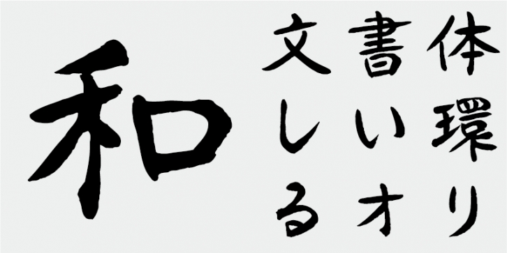
AB-nara was derived from a design in the traditional kaisho (“Regular†brush script) style.
In elementary school, I learned handwriting and calligraphy from my principal. It was a small school near the UNESCO World Heritage Site: “Sacred Island of Okinoshima and Associated Sites in the Munakata Region†with around three hundred students. A regional calligraphy contest was held two or three times a year. Many schools participated and my school often won the first prize. Before each competition, I practiced writing characters over and over until eight o’clock in the night. My goal, then, was to write perfectly in the styles of the three masters in the Tang Dynasty of China: Ouyou Jun (Ouyang Xun), Gu Seinan (Yu Shinan), and Cho Suiryo (Chu Suilian).
Even after I started working at a bank, I joined a handwriting club and actively continued to learn the skill of handwriting. I felt very lucky and happy to learn from a master calligrapher, who I greatly admired.
Later I moved to Nara and worked as a professional calligrapher for hotels and other customers. One of my tasks was to write various certificates in a polite and ordered style. In those days, personal computers were not yet available.
A calligraphy designer working in advertising recommended that I design typefaces, and I joined the Japan Typography Association. I was not familiar with typeface design, but I admired other members who understood type design well and knew that very subtle elements of a character, such as the number of strokes, stroke weight, and spaces between strokes, could have a large effect on the overall appearance of a typeface.
Because I learned calligraphy, I joined Font1000. I spent around three weeks designing a set of characters, and with the help of a fellow Font1000 member, I was able digitize my characters on a PC. AB-Nara is intended to be a brush script typeface originating from Nara.
This font includes top 1,000 kanji characters chosen from character frequency tables made by newspaper companies, publishing houses and linguistic research institutes, plus 206 kana characters and punctuation marks.
In Japanese font production today, the 7,000 characters in the JIS standard are considered essential. But, do all fonts really need 7,000 characters? In the age of phototypesetting, far fewer characters were needed. FONT1000, a group of independent type designers, started with that simple question. We have selected the minimum 1,000 kanji (ideographic) characters needed for typesetting in Japanese and actively created typefaces and fonts to support it. This 1,000-kanji-character set was selected using character frequency data compiled by newspaper companies, publishing houses and linguistic research organizations, etc., and also includes kana syllabic characters and punctuation marks. FONT1000 was formed in 2001 with 25 designers and 25 typefaces. Today we have 130 typefaces and have grown to include nearly 40 members, making it possible to work on fonts with more characters.
Supported languages: German, Spanish, Dutch, English, Polish, Russian, French, Czech, Swedish, Portuguese, Catalan, Italian, Slovenian, Maltese, Arabic, Devanagari, Greek, Gujarati, Gurmukhi, Hebrew, Chinese (hk), Japanese, Korean, Tamil, Chinese (Traditional), Chinese (Simplified), Turkish, Hungarian, Vietnamese, Bengali, Kannada, Cherokee, Thai, Armenian, Belarusian, Danish, Macedonian, Ukrainian, Norwegian, Serbian, Telugu, Malayalam, IPA, Latvian, Chinese Pinyin, Finnish, Filipino, Malay, Croatian, Kazakh, Romanian, Persian, Indonesian, Slovak, Hindi
File Size: 11.13 MB
Release date: April 5, 2021
You can use this font for:
- Design projects: create images or vector artwork, including logos
- Website publishing: create a Web Project to add any font from our service to your website
- PDFs: embed fonts in PDFs for viewing and printing
- Video and broadcast: use fonts to create in-house or commercial video content and more
- The fonts are designed to work on MacOS (Apple) and Windows (Microsoft)


