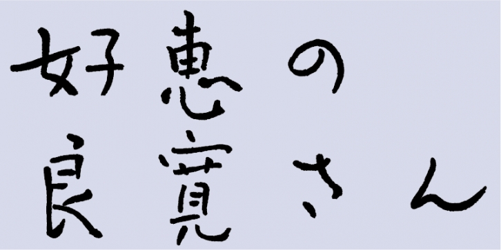
Ryokan was a Zen monk from the Edo Period and a skilled calligrapher. Before creating this brush-script typeface, I carefully studied Ryokan’s works and practiced writing characters in his style over and over each day. Finally, I produced a font based on my brush-script typeface design.
Japan has a culture of “kana writingâ€. Kana letter forms are characterized by uniquely soft and flexible shapes with rounded stroke features. Ryokan’s kanji letter forms share some characteristics typically unique to kana writing. Ryokan’s characters may look unbalanced, but are actually exquisitely well-balanced, due to wider spaces within a character shape, as if the character is filled with air.
Producing digital fonts based on traditional calligraphy is difficult. Traditionally, characters were written from top to bottom with successive characters arranged fluidly and frequently connected. Unlike traditional writing with a brush, a digital font needs to support both horizontal and vertical writing modes and offer more precise control of character sizes. As you type using this typeface, it may become difficult to control spaces between characters, but within this difficulty, there is a kind of freedom. Although Ryokan’s original calligraphic works typically contained many thin characters, I created three weights, M, DB and B. This brush-script font aims to reproduce the modesty, tolerance and open-mindedness, and humility expressed by Ryokan’s letter forms. Please enjoy using this typeface.
This font includes the 1,000 kanji characters most frequently used by newspaper companies, publishing houses, and linguistic research institutes, plus 206 kana characters and punctuation marks.
Ryokan was a Zen monk from the late Edo period (1603–1868). He created highly regarded calligraphic works displaying a humane and free-form quality. His calligraphy was based on the tradition of masters such Kaiso (Huaisu) from the Tang Dynasty in China.
The Yoshie no Ryokan-san family originally had two variations: “Yoshie no Ryokan-sanâ€, a brush-script typeface closely matching Ryokan’s writing, and “Yoshie no Ryokan-san Penâ€, a script typeface based on Ryokan’s writing with a felt tip pen. This version is the brush-script typeface.
Supported languages: German, Spanish, Dutch, English, Polish, Russian, French, Czech, Swedish, Portuguese, Catalan, Italian, Slovenian, Maltese, Arabic, Devanagari, Greek, Gujarati, Gurmukhi, Hebrew, Chinese (hk), Japanese, Korean, Tamil, Chinese (Traditional), Chinese (Simplified), Turkish, Hungarian, Vietnamese, Bengali, Kannada, Cherokee, Thai, Armenian, Belarusian, Danish, Macedonian, Ukrainian, Norwegian, Serbian, Telugu, Malayalam, IPA, Latvian, Chinese Pinyin, Finnish, Filipino, Malay, Croatian, Kazakh, Romanian, Persian, Indonesian, Slovak, Hindi
File Size: 5.24 MB
Release date: April 5, 2021
You can use this font for:
- Design projects: create images or vector artwork, including logos
- Website publishing: create a Web Project to add any font from our service to your website
- PDFs: embed fonts in PDFs for viewing and printing
- Video and broadcast: use fonts to create in-house or commercial video content and more
- The fonts are designed to work on MacOS (Apple) and Windows (Microsoft)


