
Summary
Accessible Font is a typeface that occurred with the results of the research project. This study conducted at the University of Esad.Cr. It was investigated the reading difficulties of individuals with autism based on learning difficulties. Design and research process of the project took three years. Accessible font was developed to use in the reading education of individuals with autism and learning disabilities. Accessible font is based on the opinions of special education teachers, legibility research and interviews. Accessible Font has a legible and multilanguage structure with 5 versions eight sets six weight. It has customisation support, so teachers can use different fonts according to the variable learning to read difficulties on individuals. In this way, teachers can make effective teaching according to individuals problem in reading education.
Research
The research consists from a literature review on autism, interview with special education teachers (Turkey) and survey study (Turkey, England, USA). In the study, it was seen that reading problems of individuals with autism don't characterize with autistic symptomology nor dyslexia. It was concluded their reading profile is delayed impairment reading profile and it may due to learning disabilities. For this reason, the font family was developed not only for individuals with autism but also for individuals who have difficulty in learning to read. Accessible fon was developed with various versions and sets to meet different individuals needs in learning to read.
Design
The design process is based on the opinions of special education teachers, reading errors and readability research. as a result of the design process, Accessible font came up with five versions, eight sets and six weights(v.1, v.5). In this context, the typeface design allows the teachers to change the font design according to the mistakes made by the student in reading education and their needs in learning to letter or words. version 1 and version 5 are prepared for long texts as legible structure. Version 2, 3 and 4 are designed to reduce students' reading errors and help to learn phonics. Accessible font design is unique no font has been prepared before according to these features and the ways. The version 2, 3 and 4 has been prepared by going beyond the conventional type design. In order to achieve this, the most common letterforms pairs that cause misreadings were identified by research, and new features (serif or stimuli) were added or redesign again to reduce to similarities between similar letterforms (as an example b-d, p-q-g, n-m, I-l-i,). The serifs that applied on the letterforms have placed to different directions than each other in order to identify letterforms structure easily. Each version has unique features please check the version features to understand the differences in the design process.
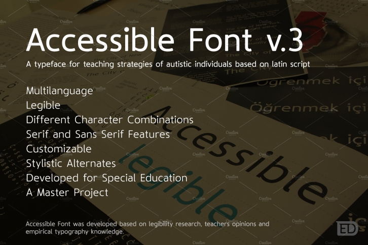
Version 3
The Regular v.3 typeface was designed specifically for individuals who have difficulty in distinguishing similar letterforms. The main purpose of the design in the regular v.3 font was to design similar letters to distinguish each other. however, care was taken not to disturb the harmony and balance in the font family. It has been tried to reduce the similarities by adding serif features and different character shapes on similar letterforms (like b, d, p, q,). In addition to these features of V.3, it was added serif features to extended letterforms from V.2 and it is coded as a set 1. So teachers can combine features of Regular v.2 with Regular v.3. If the teachers want to swap the serif between basic Latin letterforms and extended letterforms, they can use set 2. Accessible typeface family was created based on the practices of the educators, typeface designers and researchers in the fields of psychology. The aim of the typeface study is to find solutions to the problems of the individuals who have difficulties in reading and the process of learning to read.
Accessible Font was designed with a large x-height, large dotes, diacritics characters, legible structure, large letter-spacing (side bearings), different letterform combinations and reducing similarities between letterforms. The Accessible stand out with extended characters that support almost 200 Latin-based languages, covering math symbols, punctuation, and currencies.
Accessible font family is a simple and harmonious appearance as well as it offers great customization support to the pedagogues with differences in letterform design and stylistic combinations. As a result, a typeface is appeared to meet the individual requirements in which the teachers can change the character design according to students needs. This makes the Accessible font accessible for everyone.
ACCESSIBLE FONT DEVELOPED TO ENSURE EASILY LEARN TO READ AND READING WITHOUT MISREADINGS FOR INDIVIDUALS WITH AUTISM AND LEARNING DISABILITY. www.accessiblefont.com
Accessible Font version 1: https://creativemarket.com/efecanserin/4018345-Accessible-Font-Version-1?u=efecanserin
Accessible Font version 2: https://creativemarket.com/efecanserin/4021321-Accessible-Font-Version-2?u=efecanserin
Accessible Font version 3: https://creativemarket.com/efecanserin/4024487-Accessible-Font-v.3?u=efecanserin
Accessible Font version 4: https://creativemarket.com/efecanserin/4026108-Accessible-Font-Version-4?u=efecanserin
Accessible Font version 5: https://creativemarket.com/efecanserin/4012304-Accessible-Font-Version-5?u=efecanserin
Decoding study templates: https://creativemarket.com/efecanserin/4000958-Decoding-study-templates?u=efecanserin
