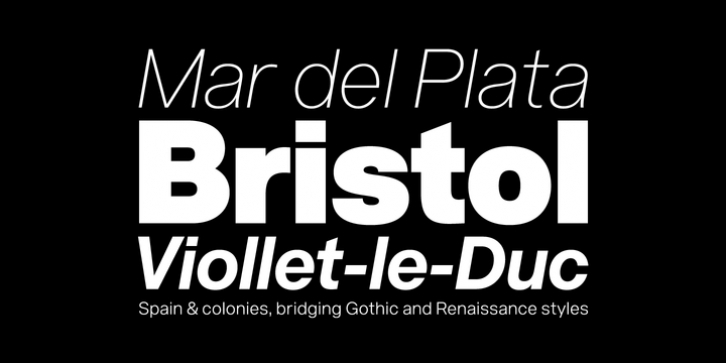
Acronym is a highly refined neo-grotesque sans serif based on Helvetica and its modern-day variants. Although it stays true to the essence of ‘Helvetica’ conceptually, it’s not restrained by an attempt at upholding historical accuracy or formalities. Acronym pays homage to the original by staying in tight conceptual alignment, yet deviates freely within those same bounds. Everything from the metrics, x-height, descender length, character width, contrast, through to the drawing, structure, refinement, and detail of each letterform is uniquely its own. Entirely new, yet very familiar, its character is defined by pushing the limits of, and applying, a strict set of related values throughout the design process. Among others of similar classification, Acronym is distinguished specifically by the clarity, balance, symmetry, alignment or reductionism of its letterforms and letter pairings.
Considering its versatile nature, the range of styles are designed to be as thorough as possible. Two supplemental weights add to the initial range spanning from Hairline to Black, totalling twenty styles. Thin and Extrablack are subtle weight variants that break from the evenly staggered weight division, allowing for a slightly increased range. The ten roman styles are complemented by a corresponding
set of italics. Carefully scrutinized and labored over, the optical distortion caused by slanting has been corrected, with the italic styles imparting the same sense of solidity, attention, and refinement as the romans.
Features include:
Precision kerning
Standard Ligatures set including ‘f’ ligatures (ff, fi, fj, fl, ffi, ffj, ffl, ae, oe, AE, OE)
Discretionary Ligatures set including (No [numero])
Alternate characters (R, Aringacute, hcircumflex, and numero sign)
Case forms (shifts various punctuation marks up to a position that works better with all-capital sequences)
Capital Spacing (globally adjusts inter-glyph spacing for all-capital text)
Slashed zero
Full set of numerators/denominators superior/inferior numerals
Automatic fraction feature (supports any fraction combination)
Extended language support (Latin-1 and Latin Extended-A)
*Requires an application with OpenType and/or Unicode support.
File Size: 15.95 MB
Tags: bold, capital sharp s, display, grotesk, hairline, headline, neo-grotesque, neutral, poster, sans serif, swiss, versal eszett
Release date: February 13, 2013
You can use this font for:
- Design projects: create images or vector artwork, including logos
- Website publishing: create a Web Project to add any font from our service to your website
- PDFs: embed fonts in PDFs for viewing and printing
- Video and broadcast: use fonts to create in-house or commercial video content and more
- The fonts are designed to work on MacOS (Apple) and Windows (Microsoft)
Preview:

