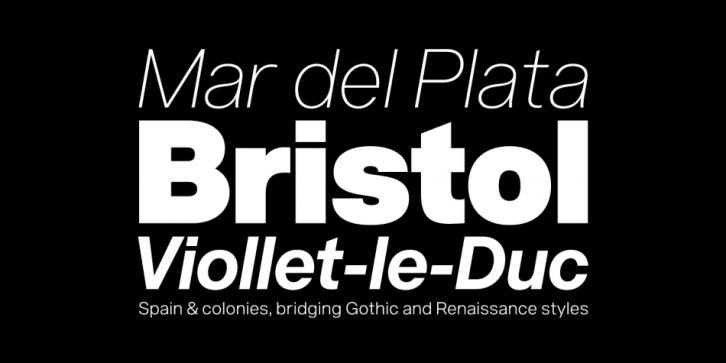

Acronym is a highly refined neo-grotesque sans-serif based on Helvetica and its modern day variants. Although it stays true to the essence of ‘Helvetica’ conceptually, it’s not restrained by an attempt at upholding historical accuracy or formalities. Acronym pays homage to the original by staying in tight conceptual alignment, yet deviates freely within those same bounds. Everything from the metrics, x-height, descender length, character width, contrast, through to the drawing, structure, refinement, and detail of each letterform is uniquely its own. Entirely new, yet very familiar, its character is defined by pushing the limits of, and applying, a strict set of related values throughout the design process. Among others of similar classification, Acronym is distinguished specifically by the clarity, balance, symmetry, alignment or reductionism of its letterforms and letter pairings.
Considering its versatile nature, the range of styles are designed to be as thorough as possible. Two supplemental weights add to the initial range spanning from Hairline to Black, totalling twenty styles. Thin and Extrablack are subtle weight variants that break from the evenly staggered weight division, allowing for a slightly increased range. The ten roman styles are complimented by a corresponding set of italics. Carefully scrutinized and labored over, the optical distortion caused by slanting has been corrected, with the italic styles imparting the same sense of solidity, attention, and refinement as the romans.
Font Family: