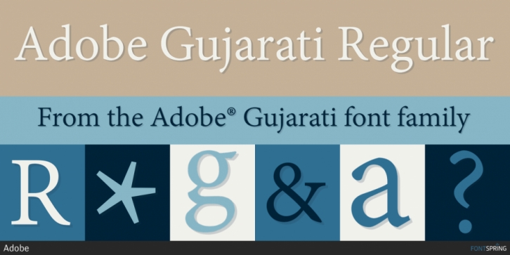

The Adobe Gujarati typeface was designed by David Březina for Adobe from 2012 to 2013. Gujarati script expert Fiona Ross consulted on the design, with Kalapi Gajjar-Bordawekar and Hitesh Malaviya providing feedback. This type family was designed to harmonize with Adobe Devanagari, both in terms of apparent size and style, to ensure the two families could be typeset together as a system. The primary intended usage  ̶  for printed outputs, particularly continuous text settings  ̶  guided the design direction.
The letter construction is based on traditional Gujarati calligraphy and features a contrast distribution somewhat lower than the norm so as to maintain strong, legible forms at small sizes. The design features careful attention to shaping and details that allow these typefaces to also serve well as display types at larger sizes.
The Adobe Gujarati fonts comply with the Unicode standard for character encoding and leverage the technology of OpenType to produce correct script shaping and accurate mark placement. As much as possible, conjuncts are formed using a combination of half forms of consonants and careful kerning to maintain a minimal glyph set. For more intricately formed conjuncts, the fonts feature an extensive set to cover all of the most widely occurring syllables in the Gujarati language. The length of the ikars—િ and ી—varies automatically according to adjacent letter or conjunct width. Proper shaping of rukars on vertical stems is achieved with smart OpenType substitutions in these contexts. Careful attention has been given to the placement of all vowel signs and modifiers. The fonts include both proportional and tabular numerals in Indian and European styles.
The Adobe Gujarati fonts are further examples of Adobe’s high standards in design and acute attention to technical quality, and provide an excellent alternative to existing digital Gujarati types.
Font Family: