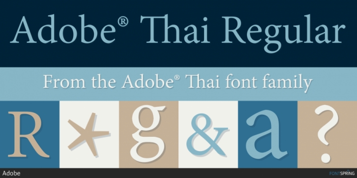

The Adobe Thai typefaces were commissioned to from Tiro Typeworks and collaboratively designed by Fiona Ross, John Hudson and Tim Holloway in 2004-05. The design brief was to create a type family that would meet the needs of modern Thai business communications. The design needed to be clean and contemporary, and also to be readable on screen in, for example, interactive PDF forms.
The Regular type needed to be a low contrast design to avoid greying-out of hairlines at typical text sizes on screen. Although the Regular is close to mono-linear, stylistically, it reflects some of the subtlety of traditional Thai lettering and type: shearing certain free verticals and horizontal feet according to the pen, gradually flaring stems and shifting the slight stress pattern on top flourishes, marks and numerals away from the vertical.
In this design, for a brighter effect, rings as well as loops are cusped at the stem and slightly elongated.
The Bold design has a higher contrast and plays with this to conserve a bright effect: contrasting heavy stems with characteristically light diagonals and rings. The shifting stress pattern is most evident here, particularly in the traditional Thai numerals.
To enhance the forward movement of the overall design, superior vowel marks are tilted in the classic way. These and other marks are dynamically positioned using OpenType glyph positioning lookups. Variant small tone marks are automatically used in mark stacks.
The designers would like to acknowledge the assistance and feedback they received from the late Dr Henry Ginsburg, Curator of Thai and Cambodian Collections at the British Library, who provided generous access to Thai manuscripts and print resources during the development of these fonts.
Font Family: