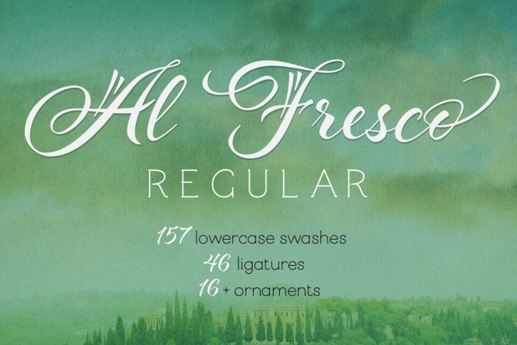

To view the User Guide that shows all of the features and what's included, visit: http://bit.ly/1YFKQyj
NOTE: For questions, including how to use this font and access alternates, please visit the FAQs page on my website: http://lauraworthingtontype.com/faqs/
Al Fresco is a breezy, light, yet expressive typeface perfect for packaging products and titling work that call for a youthful, delectable flair. Its elegance carries a subtle earthiness; its beauty is unconventional, both stylish and exuberant. Al Fresco is made even more versatile when titling is activated (in the OpenType palette,) served along with swash forms, contextual alternates, and ornaments to sweeten this tasty typeface.
As with my other type designs, Al Fresco doesn’t live in isolation, but evokes a special ambience, era, or lifestyle—in this case, an enviably carefree, chic, and organically trendsetting life, authentic and true to oneself and simply delicious. Naturally, each designer who uses my work filters it through their unique interpretation, imbuing the fonts with a wonderful array of results such as those found on menus, food packaging, branding for light colognes, or young, hip, clothing boutiques. Al Fresco was born in my imagination as an emblem of dining outside at twilight under twinkling lights, laughing warmly with friends, sipping signature cocktails and eating tapas—each bite dripping with intense flavor. In the workday setting, Al Fresco represents a style that is pretty but not dressy: swishy bright flowery skirts and cute little flats. “Business casual,†not cubicle prisoner. After all, Al Fresco comes from the 18th century Italian “in the fresh air.â€
For those who are familiar with my Hummingbird typeface, Al Fresco has a more loose and unrestrained feel. I created it using faster strokes, and was unconcerned with convention. After the complexity of my Charcuteries family of typefaces, I longed for simplicity. I returned to simple tools: little felt brush pens with fixed tips, fun to use for practicing lettering. To loosen up after hours of intense design, I wanted to play with forms and tools that were refreshing and clean. Starting with the word “Irresistible,†I began filling pages with letters and words. While I usually start with lowercase letters, my initial focus with Al Fresco’s shape began with strong uppercase letters that set the tone for what I then realized would be my next typeface. While lowercase letters are used more frequently, making Al Fresco’s uppercase letters the focal point added an opportunity for variety and an unconventionality—it can’t really be attributed to any one style. That, in turn, colored the lowercase letters, allowing some “fresh air†into the design. Each word in a type specimen is distinctly different from the words alongside it. Each is a little bit unexpected.
Al Fresco, which includes a User’s Guide, makes ample use of Open Type features. If you activate titling, the loops have been removed from the lowercase ascenders and descenders, giving the typeface a cleaner aesthetic and more contemporary feel. This feature provides you with fonts that are almost a style within a style. 157 lowercase swash forms, 46 ligatures (most of which are purely decorative rather than functional), and 16 ornaments are the cherry on top—or in the case of Al Fresco, the marinated Spanish olive in your martini.
As often discovered in my work, there are always more treasures in the package. In this case, two additional sets of uppercase letters are included. When contextual alternates are activated, you’ll find that ending strokes have been minimized. (Software often turns these on by default.) This additional feature offers a more natural look, adding a slight randomness or quirkiness—a special touch that reveals the warmth and uniqueness of the human hand and mind.
