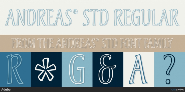

Michael Harvey first drew the lettering that became the foundation for Andreas in 1988 as part of the book jacket design for The Studios of Paris, a Yale University Press publication. In keeping with the book’s subject, Harvey wanted letterforms that reflected the Art Nouveau period. In addition, the type had to be narrow enough to fit the title across the top so as not to intrude on the Van Gogh painting that filled the rest of the jacket. To accomplish this end, he drew the letterforms freehand, giving them shapely stems and the high-waisted look characteristic of Art Nouveau lettering. He also added distinctive junctions to the D, P, and R. The jacket’s design further required that the title reverse out in white. Harvey felt that a solid letter would have been too heavy, so he drew it in outline, which contributes to its graceful, ethereal impression. All of which makes Andreas a good choice for wine labels, upscale food packaging, resort brochures and identities, book design, and magazine titling.
Font Family: Andreas® Std Regular