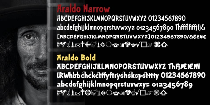

Araldo is a headline font with spunk for today. I needed something with a little life for my favorite book production group: Biblia Serif, Dreatha, and now Araldo. This new font family is doing well for me.
Biblia Serif and Draetha are both excellent book production font families. In other words, they are not memorable. In fact, if they do their job well, you don’t even notice them.
But as I mention in the Araldo Spec Sheet (where I’m using these fonts), there come times when you must break out of those restrictions and bring a bit of life into the layout. Araldo was designed to meet that need.
I’m happy to say, it seems to be working well. It’s a little in your face, but not too heavy about it. It seems to give a nice respite in the middle of the seriousness of the day. I’m quite pleased so far. I want to do some more fonts like this, but it’s a good start.
Araldo is Italian for a herald, one who proclaims. For me that goes well with Biblia Serif, and Dreatha [which is Welsh for preach]. There may be more in the future, but for now these two styles are all that I’ve produced. Araldo is built with the same metrics as the rest of the group, but it is much looser and makes dramatic, or at least intriguing, heads.
The bold version was a lot of fun. The stem thickness was too large to fit three times within the x-height. So, I had to modify the a, e, s, and z. It also made small caps virtually impossible.
For a touch of nostalgia, since it is actually a major modification of my first font—NuevoLitho, I also added all the old ligatures I used to use when I first started designing fonts in 1994. With the ligatures, you can make many special word images. There are over a dozen to work with.
