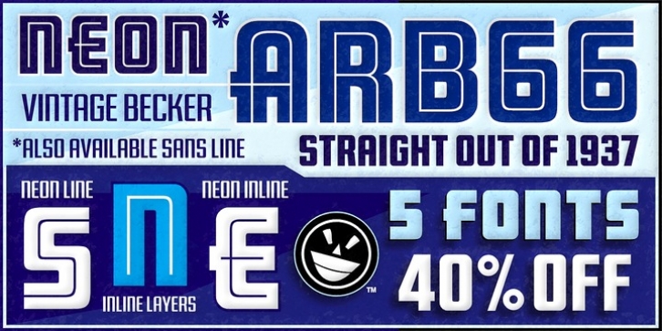

As published in June, 1937, this is the description that accompanied Becker's 66th alphabet, Neonline:
NEONLINE, alphabet No. 66 in Alf R. Becker's SIGNS of the Times series, is a very bold, modern style for feature display lettering. Care should be taken in the laying out of this alphabet, and every letter should be made as bold as possible.
Well that was a bit of an understatement! Fortunately, this font pak isn't understated. After the main Neon font was finished, a ton of work went into developing alternate character ranges, a second neon effect, a layering option accessible via the styles menu, and two supplemental fonts for the headlining and text chores. And did I mention the extensive kerning? The finished result is a handy little family that can tackle of wide variety of design needs.
Many font designers have tackled the task of taking Becker's incredible achievement from paper to digital, and many claim to treat his work with care and dignity. But the Fontry's Becker fonts remain the most historically accurate and viable treatments available, arriving in two industry-satisfying versions: CAS (Computer-Aided Signmaking) and DTP (Desktop Publishing).
Font Family:
· ARB 66 Neon Inline JUN-37 CAS Bold
· ARB 66 Neon Inline JUN-37 DTP Bold
· ARB 66 Neon Strunked JUN-37 CAS Normal
· ARB 66 Neon Strunked JUN-37 DTP Normal
· ARB 66 Neon Stance JUN-37 CAS Normal
· ARB 66 Neon Stance JUN-37 DTP Normal
· ARB 66 Neon Inline JUN-37 CAS Normal Italic
· ARB 66 Neon Blank JUN-37 DTP Normal
· ARB 66 Neon Inline JUN-37 DTP Normal Italic
· ARB 66 Neon Blank JUN-37 CAS Normal
· ARB 66 Neon Line JUN-37 DTP Normal
· ARB 66 Neon Inline JUN-37 CAS Normal
· ARB 66 Neon Inline JUN-37 DTP Normal
· ARB 66 Neon Line JUN-37 CAS Normal
File Size: 21.99 MB
