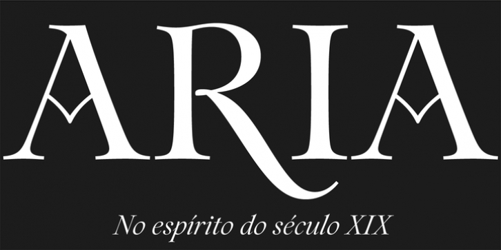
The inspiration for this typeface came from the epigraph on a frame of a nineteenth century painting. I was fascinated by the peculiar capitals of the inscription. The high contrast, and the overall quirkiness, especially the tail of the R and the oblique stems on the M, was interesting. I decided to draw a display font with high contrast and a vertical axis, in a reference to the transitional form. Still I wanted to capture the spirit of the original letters, which to me are so imbued with Romanticism. This approach allowed for some exuberance on the regular style, but also led to more calligraphic letterforms in the italic – in which “the flow of the curves” lead the way. To add to this epigraphic nature there is a number of ornaments that accompany words accordingly to their uppercase or lowercase form. For versatility there’s also a good amount of ligatures, alternative glyphs, and a special set of ornamental numbers.
File Size: 1.83 MB
Tags: awarded, decorative, display, elegant, epigraph, fashion, high contrast, letter.2, letter2, magazine, premium, transitional
Release date: December 15, 2014
You can use this font for:
- Design projects: create images or vector artwork, including logos
- Website publishing: create a Web Project to add any font from our service to your website
- PDFs: embed fonts in PDFs for viewing and printing
- Video and broadcast: use fonts to create in-house or commercial video content and more
- The fonts are designed to work on MacOS (Apple) and Windows (Microsoft)
Preview:

