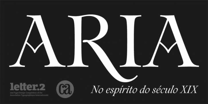

Aria Pro is a titling face inspired by the epigraph of a frame of a nineteenth century painting, Cinco Artistas em Sintra by João Cristino da Silva, belonging to the collection of the Museu do Chiado. The high contrast letterforms, their overall quirkiness and the lyricism of the painting itself, served as the theme to the design of this transitional style typeface. That approach allowed for some exuberance on the regular style, but also led to more calligraphic letterforms on the italic.
Aria Pro comes with an extra set of ornamental numbers, stylistic alternates, ornaments and more.
Aria Pro was a winning entry of Atypi Letter.2; was selected for the Typography Annual 2 of Communication Arts and was one of Typographica’s favourite typefaces of 2011.
Font Family: