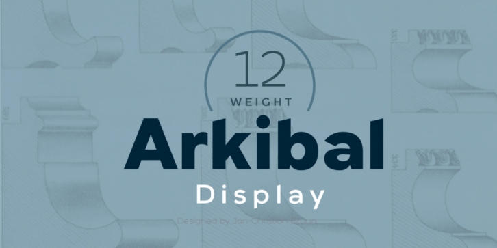
Designed by Jan-Christian Bruun, Arkibal Display is a sans serif font family. This typeface has twelve styles and was published by JC Design Studio.
Arkibal Display
Display version is a little different from Sans family, where “a” is the center of the whole font. And letters “l, b, d, p, q, and t” is the moved slight angle. The idea was to make two versions with a different selection of letters. It provides good dynamics and structure of display version.
The inspiration comes from some old documents and store signs from my great-grandfather’s old gold list factory from 1838. He delivered hits for many artists of that time, and various museums in Copenhagen. Uppercase ‘G’ was the first letter of the starting point. G stands for in Danish ‘Guldramme’, which means ‘Goldframe’. Arkibal is coming from an almost old danish tradional name “Arkibald”, only without “d”.
Font Family:·
Arkibal Display Thin·
Arkibal Display Thin Italic·
Arkibal Display Light·
Arkibal Display Light Italic·
Arkibal Display Medium·
Arkibal Display Medium Italic·
Arkibal Display Regular·
Arkibal Display Italic·
Arkibal Display Bold·
Arkibal Display Bold Italic·
Arkibal Display Heavy·
Arkibal Display Heavy ItalicFile Size: 14.50 MB
Release date: October 24, 2017
You can use this font for:
- Design projects: create images or vector artwork, including logos
- Website publishing: create a Web Project to add any font from our service to your website
- PDFs: embed fonts in PDFs for viewing and printing
- Video and broadcast: use fonts to create in-house or commercial video content and more
- The fonts are designed to work on MacOS (Apple) and Windows (Microsoft)
Preview:

