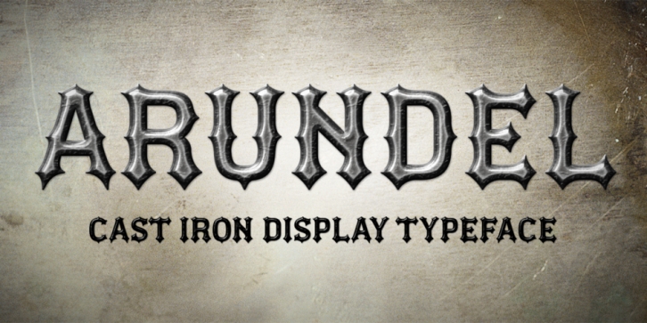

My third typeface release is Arundel, inspired by cast iron lettering above the former Arundel store in my home village. I had been walking past this iconic façade for over 2 years admiring their “heavy metal†style and could easily envisage a typeface that could be used for band logos, posters and even product branding.
It is difficult to age the existing Arundel type, it is definitely blacksmith-made and forged in iron. Naturally, my promotional images play on that metallic feel.
I see Arundel as being a typeface that feels immediately at home within the heavy metal genre; posters, logos, etc., but could also work equally as well for branding craft beers, engineering products and high fashion lingerie… okay, maybe not the lingerie… Arundel is primarily a display typeface for titles/headlines in printed materials. I imagine designers will use Arundel for branding, packaging and promotional material and am keen to hear from anyone who uses it in their own work.
There are 2 design styles within this typeface, upper case letterforms are faithful to the original curvaceous design, whereas the lowercase letterforms are more angular with additional spurs.
Font Family: Arundel Solid