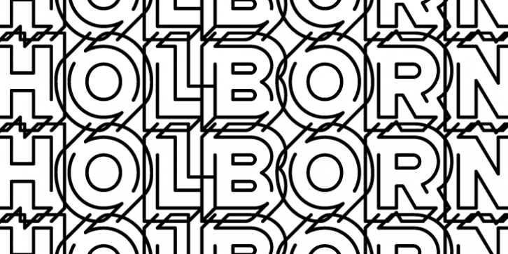
AT Move Holborn was designed by André Toet, Jasper Nijssen and published by André Toet Design. AT Move Holborn contains 1 style.
HOLBORN Aptly named after 'High Holborn', a high-street in London where the Central School of Art & Design was based. A font, just in capitals, based on the original design and the earlier sketches (1976) by André Toet. The strong optical illusion in this alphabet makes it an outstanding typeface. Concept/Art Direction/Design: André Toet © 2017
Font Family: AT Move HolbornFile Size: 12.48 MB
Tags: 3d,
connection,
fun, fused,
intertwined,
outline,
shadowRelease date: November 18, 2012
You can use this font for:
- Design projects: create images or vector artwork, including logos
- Website publishing: create a Web Project to add any font from our service to your website
- PDFs: embed fonts in PDFs for viewing and printing
- Video and broadcast: use fonts to create in-house or commercial video content and more
- The fonts are designed to work on MacOS (Apple) and Windows (Microsoft)
Preview:

