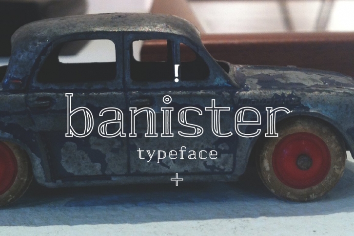

Banister looks both contemporary and vintage. It contains a total of 12 styles including two main styles (Normal and Loaded), and for each style it comes with two widths (Semi-condensed and Semi-Expanded) and three weights (Light, Regular and Bold). The 40’s inspired style is subtle in banister, so it comes across more contemporary. Also, slightly curved strokes can be found on some letters, which gives a more organic feeling overall. To gain full advantage of banister, you can toggle “Fill†and “Stroke†on any editable applications to experiment the style, also layering normal and loaded styles let you discover something unexpected.
Banister is versatile, simple and organic looking typeface, and good for headlines, logos, tiles and any large texts.
