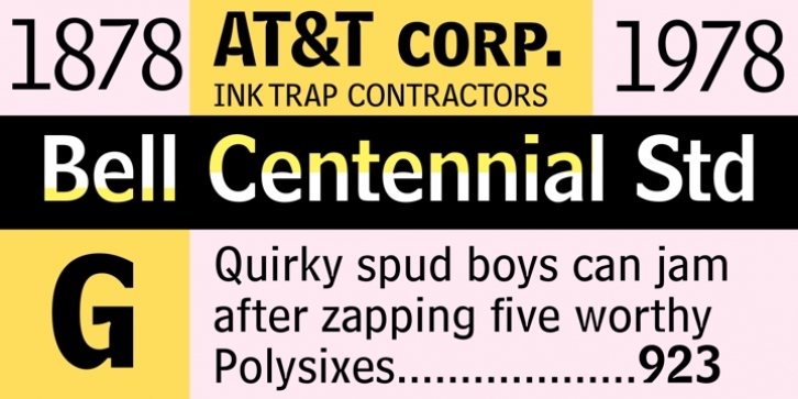
Bell Centennial was designed by Matthew Carter and published by Adobe. Bell Centennial contains 4 styles and family package options.
Matthew Carter designed Bell Centennial in 1978 specifically for AT&T Corporation (the name honors their 100th anniversary) to use in telephone books. Carter developed it to have high legibility at small sizes, and for composition on high-speed, cathode-ray-tube composing machines. (Bell Gothic, the typeface originally designed for telephone books in 1937 and for composition on the hot metal Linotype machines, was no longer usable in the new technology.) Bell Centennial is a sturdy, condensed sans-serif design that achieves great economy of space while being highly legible.
Bell Centennial can be used for modern display purposes and, of course, for small print and lists. The Alternate version of Bell Centennial Bold Listing sits on a standard baseline; the original version sits far below the baseline, and cannot mix properly with other fonts on the same line.
Font Family:
· Bell Centennial Std Address
· Bell Centennial Std Sub Caption
· Bell Centennial Std Name & Number
· Bell Centennial Std Bold Listing Package
File Size: 20.16 MB
Tags: business text,
grotesk, ink traps,
legible, news text, phonebook,
sans-serif, small sizes, specialized
Release date: December 2, 2007
You can use this font for:
- Design projects: create images or vector artwork, including logos
- Website publishing: create a Web Project to add any font from our service to your website
- PDFs: embed fonts in PDFs for viewing and printing
- Video and broadcast: use fonts to create in-house or commercial video content and more
- The fonts are designed to work on MacOS (Apple) and Windows (Microsoft)
Preview:

