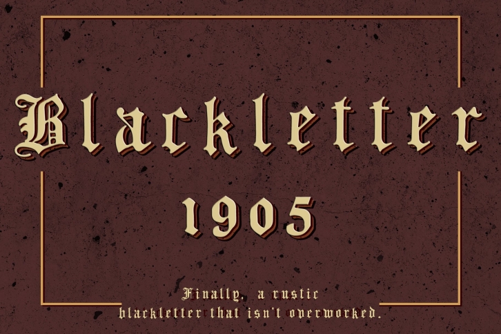

Blackletter 1905 is the second font in a series I'm archiving from an old architectural correspondence course book I found one fateful day while estate sale shopping with my wife.
I use this font in my work specifically when I'm looking for a blackletter that shys away from that overly-perfected look (the way, in my mind, blackletter is supposed to be - slightly janky).
I like to think of the tedious copying of passages of literature before the printing press, imagine making the last mark at the end of the passage, sore wrist and ink-stained fingers, and noticing that ONE letter is SLIGHTLY crooked, you're not gonna burn the whole page just for that. You wrap up the scroll and hope no one notices. This font is an homage to that moment.
Suggested use: Pablo Tee rip offs, church bulletins, pre-1600 literature book covers.
What's included?
Can I use this in _____ project?
Shoot me an email or message. Most likely yes.
Shoot me a message with any questions!
Jeffry
