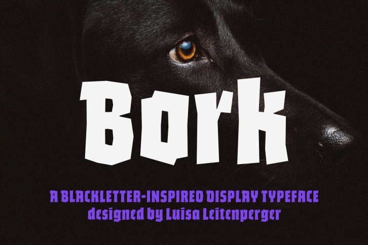

Bork is a display typeface that was inspired by an exercise in blackletter calligraphy. The style’s characteristic dark texture is seen mainly in the lowercase, with uniform spacing (where counterspace equals letterspace), shapes that recall the straight, interrupted strokes used in that style of writing, and the peculiar construction of certain letters. On the other hand, the uppercase aims for a more conventional roman construction, making it more legible for modern-day readers.
It features an extensive character set that includes contextual and stylistic alternates, superior and inferior figures, arbitrary fractions, as well as several unusual ornaments, symbols and punctuation. Bork is especially suited for use in book covers, headlines, packaging and logotypes.
Unlike all the other typefaces at Harbor Type so far, Bork was not designed by me, Henrique, and I am very proud of that. This impeccable work was entirely done by Luisa Leitenperger.
