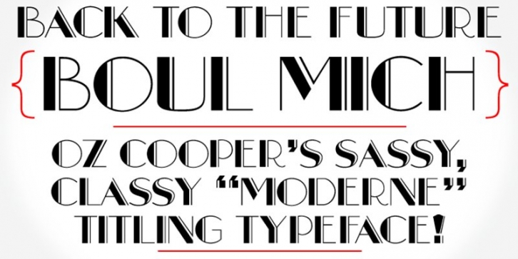

The digital debut of Oz Cooper’s “Moderne†Broadway-esque titling typeface, Boul Mich!
1927 was a discouraging year for Oswald Bruce Cooper, having to devote his time to developing faddish display typefaces based on others' designs in lieu of truly original work. Though he sidestepped blame in his essay On Cooper Type Faces, Barnhart Bros. & Spindler’s General Manager Richard N. McArthur was the one responsible for assigning Cooper busywork. McArthur put together a sampling of Broadway-esque hand lettering from assorted advertisements, suggesting a very specific incising treatment.
Cooper drew the basic forms of the letters, leaving the bulk of the work to the pattern makers at BB&S, but provided the framework from which the typeface was drawn. The typeface was named Boul Mich, after Michigan Boulevard, Chicago’s mix of carriage trade shops, elegant residences, artists' studios, and Bohemian side streets. While not a design of Cooper’s choosing, this modern typeface is a paean to the flexibility of Cooper’s skill.
Boul Mich has been lovingly redrawn from Oswald Bruce Cooper’s original drawings and mechanical proofs. It is comprised of a capital letter alphabet, full European character set, figures, and full range of diacritics. Available in OpenType and TrueType formats!
