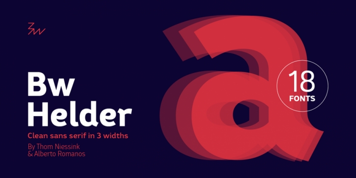
Designed by Thom Niessink and Alberto Romanos, Bw Helder is a sans serif font family. This typeface has eighteen styles and was published by Branding With Type.
Bw Helder is a clean and versatile sans serif combining gentle subtleties on its curves with remarkable spurs branching off its stems.
It instills a friendly yet professional tone of voice, while maintaining the composure when used in longer paragraphs at small sizes. Three different widths across six weights provide plenty of options and flexibility for the task at hand.
Designed by Thom Niessink & Alberto Romanos, Bw Helder is the first font on our library born out of the direct collaboration of two designers. This type family is inspired by an old piece of lettering Thom came across: The ornamental serifs featured on the original lettering have been tamed down attending to a functional criteria, conferring this type family its unique character without compromising its legibility.
Font Family:·
Bw Helder W1 Thin·
Bw Helder W1 Light·
Bw Helder W1 Regular·
Bw Helder W1 Medium·
Bw Helder W1 Bold·
Bw Helder W1 Extra Bold·
Bw Helder W2 Thin·
Bw Helder W2 Light·
Bw Helder W2 Regular·
Bw Helder W2 Medium·
Bw Helder W2 Bold·
Bw Helder W2 Extra Bold·
Bw Helder W3 Thin·
Bw Helder W3 Light·
Bw Helder W3 Regular·
Bw Helder W3 Medium·
Bw Helder W3 Bold·
Bw Helder W3 Extra BoldFile Size: 12.25 MB
Release date: July 17, 2017
You can use this font for:
- Design projects: create images or vector artwork, including logos
- Website publishing: create a Web Project to add any font from our service to your website
- PDFs: embed fonts in PDFs for viewing and printing
- Video and broadcast: use fonts to create in-house or commercial video content and more
- The fonts are designed to work on MacOS (Apple) and Windows (Microsoft)
Preview:

