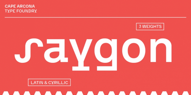

CA Saygon was originally conceived for a large corporate design project, but when it turned out that it would never be realized, the way was clear to further develop the typeface for a wider audience.
The striking design was intended to reflect the cultural ruptures in a society after post-modernism, achieved through a seemingly random encounter of different formal concepts. In fact, there is a careful consideration behind this. At the beginning of the design process there were countless different sketches and ideas on how the letters could be thrown out of their normal path. But as time went by, the choice was reduced to a point where the typeface was coherent but still irritating enough to captivate the eye. In addition, the font has several alternative letter forms that can be achieved via the Stylistic Sets or the Glyph Palette.
The language support of the typeface is quite comprehensive – besides Latin Extended there are also Cyrillic and Vietnamese. Various OpenType features complete the professional overall picture, such as superiors and inferiors, fractions and proportional and tabular numbers.
Font Family: