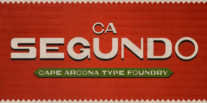

The inspiration for this font came from a wall-writing in Cuba. At first glance we thought: “There is something wrong with the wall-writing.†But a closer look revealed, that it just mixed up different stroke-styles.
That “feature†became the designing principle behind CA Segundo: round characters like O, U or C are available either with a fat or a thin stroke, whereas other characters with orthogonal lines come in two different styles – uppercase characters emphasize the vertical strokes, while lower cases emphasize the horizontal strokes.
This gives you the opportunity to design just while you type.
