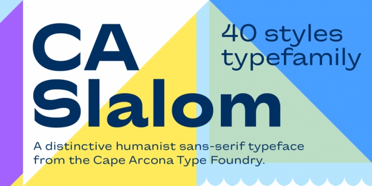
Designed by Stefan Claudius, CA Slalom Compressed is a sans serif font family. This typeface has ten styles and was published by Cape Arcona Type Foundry.
The starting point for CA Slalom was the aspiration to create a contemporary interpretation of classics like Gill and Antique Olive in terms of aesthetics, flexibility and usefulness. The outstanding S soon became the visual hook and starting from the extra bold extended weight, CA Slalom evolved into a huge family with four widths. It’s rather round instead of squarely with stroke-ends pulled deep and a relatively low x-height. This gives CA Slalom a taste of its own, and although it is clearly contemporary, it has the potential to become a classic.
Font Family:·
CA Slalom Compressed Light·
CA Slalom Compressed Light Italic·
CA Slalom Compressed Regular·
CA Slalom Compressed Italic·
CA Slalom Compressed Medium·
CA Slalom Compressed Medium Italic·
CA Slalom Compressed Bold·
CA Slalom Compressed Bold Italic·
CA Slalom Compressed Heavy·
CA Slalom Compressed Heavy ItalicFile Size: 8.32 MB
Release date: April 30, 2021
You can use this font for:
- Design projects: create images or vector artwork, including logos
- Website publishing: create a Web Project to add any font from our service to your website
- PDFs: embed fonts in PDFs for viewing and printing
- Video and broadcast: use fonts to create in-house or commercial video content and more
- The fonts are designed to work on MacOS (Apple) and Windows (Microsoft)


