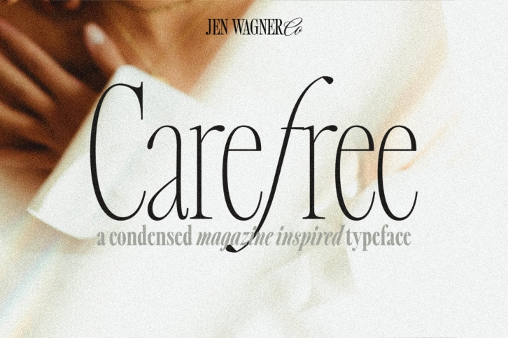

Introducing the Carefree Serif family – a gorgeous condensed serif typeface that includes 16 fonts, regular and italic, from Hairline weight to Bold.
Ironically, Carefree has been one of the more difficult serifs I've designed (but well worth it!). What started as an experiment with sharp angled italics eventually blossomed into the full family you see here, and I am head over heels for it!
Carefree makes it so simple to elevate a logo or headline text, whether you're wanting something bold or delicate.
This typeface looks best in larger settings as a display text (think big headers, pretty quotes, calls to action, etc.), but can also be really stunning for longer text like quotes (see image #4). I would probably avoid using this as a body text because of the high contrast.
I've also been loving combining the regular and italic and mixing up the weights, especially for beautiful logos (see the "Olive + Oak" logo, image #2)
One thing to note about Carefree is the letter spacing. It was intentionally spaced for clean reading and intentional balance, so I recommend setting the spacing a little tighter if you want to create the trendy, all caps look found in many of these images (around -10 to -20 should do!).
Recommended Font Pairings:
