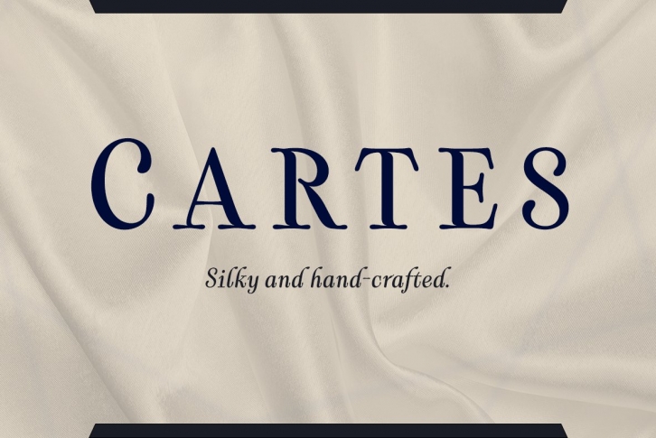

Cartes has a bit of a strange origin story, as far as fonts go. It’s a combination of ideas from 1920’s advertising and hand-painted letters from the 1500s.
This little bearcat was designed to flow with elegance and speed yet retain a sense of the handmade. The serifs flow with indentations implying movement and terminate with inky globules that lend your copy a sense of gravitas.
This typeface can be used for headlines, short texts, posters, logos, headlines, headlines in big sizes or just as easily for ad text.
At large sizes, pen strokes can be seen that give the typeface a touch of humanity and vigor. At smaller sizes the type is unique, but readable. It’s Hotsy-Totsy!
