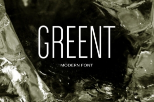
It is known that the Circe typeface is distinguished by mild and humanist nature being formally a geometric sans-serif. However, as an experiment we decided to make it even softer: Circe now has a version with rounded terminals - Circe Rounded.
Rounding is generally regarded as a mechanical operation, but in this case a lot of manual adjustment was needed because of the humanist nature and peculiarities of type design. Moreover, the two bold styles now have two options: a basic one is slightly rounded and an alternate one is fully rounded.
In Circe Rounded we decided to dismiss characters with swashes that are rather inappropriate in such a rounded font, but the stylistic sets and alternate characters are remaining.
Rounded terminals make an open and friendly typeface even more childish. For example, in quite large point sizes (because the x-height is still not big) it can be used as a body type in infant books. Circe Rounded, similar to Circe, has alternative forms of lowercase characters, which are called "infant" and are used in publications for children's reading. However, a humanist basis is preserved alongside with its softness and it does not allow it to be as "plasticine" as many other rounded fonts.
Two of the most obvious areas of possible application of Circe Rounded are everything for children and everything edible, especially all that is sweet and puff. However, we believe that there are other options.
Font Family:
· Circe Rounded Thin
· Circe Rounded Extra Light
· Circe Rounded Light
· Circe Rounded
· Circe Rounded Bold
· Circe Rounded Alt Bold
· Circe Rounded Extra Bold
· Circe Rounded Alt Extra Bold
File Size: 14.42 MB