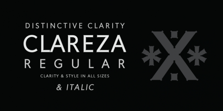
Clareza was designed by Robbie de Villiers and published by Wilton Foundry. Clareza contains 2 styles and family package options.
Clareza means "Clarity" in Portuguese. That was exactly the goal in creating this font. We managed to create a font that is crisp and extremely legible at all sizes but then comes to life in an interesting and unusual way when used as a display font. The glyph traps are at the heart of Clareza's unusual style: they were carefully designed to become a great feature at display sizes, adding an interesting personality without dominating.
Clareza is a solid Geometric workhorse ideal for clear, legible, applications including branding, advertising and signage. If you are looking for a font that is crisp with a little more personality, Clareza will absolutely fit the bill!
Font Family:
· Clareza
· Clareza Italic
File Size: 21.96 MB
Tags: advertising, billboards,
branding,
clarity, corporate identities,
legible, packaging design
Release date: November 18, 2016
You can use this font for:
- Design projects: create images or vector artwork, including logos
- Website publishing: create a Web Project to add any font from our service to your website
- PDFs: embed fonts in PDFs for viewing and printing
- Video and broadcast: use fonts to create in-house or commercial video content and more
- The fonts are designed to work on MacOS (Apple) and Windows (Microsoft)
Preview:

