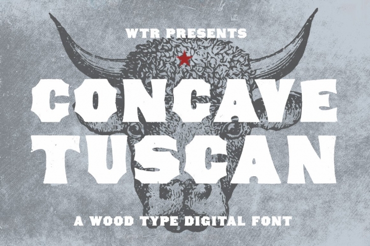

Concave Tuscan is the perfect example of an American take on the Tuscan typographic style. Its wide strokes, tiny counters, and fanciful Tuscan-style contours give it incredible solidarity paired with a disarming friendliness.
Concave Tuscan was first shown as wood type under the name Gothic Tuscan by William H. Page in James Conner’s Sons Typographic Messenger (November, 1866). Almost all the major manufacturers of the 19th century offered a version of Gothic Tuscan.
The font includes two weights: regular and distressed. The regular weight is a clean, precise redraw which captures the contours of the original wood type. The distressed weight is a rendering of the the textures of the letterpress proof itself, warts and all. The distressed weight features alternate characters with extra dings and blemishes, set as the lowercase keyboard characters.
WTR Concave Tuscan was drawn from 6-line (72 point) wood type. It is a display face, and is best used at larger sizes. A list of glyphs is shown above in the images.
Concave Tuscan is also found on Typekit for web use.
