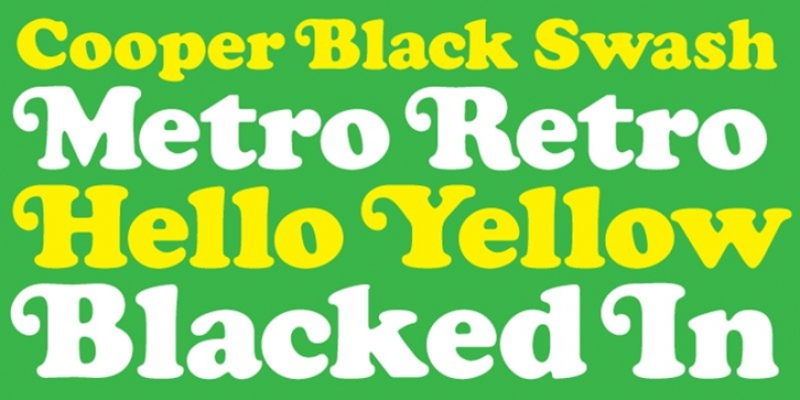

Cooper Black, the most famous and successful of Oswald Cooper’s type designs was released in 1920, following a year of development fleshing out the weight of the typeface and filling out the full character set. Cooper redrew the lowercase characters multiple times, toying with the rounded forms of the “m†and “n†and engaged in a lively debate with Barnhart Bros. and Spindler’s General Manager Richard McArthur over the final form as McArthur requested that the typeface be drawn bolder and bolder. Cooper famously said the face was "for far-sighted printers with near-sighted customers", and the public agreed. Sales of Cooper Black were voluminous, and Barnhart Brothers and Spindler had a difficult time keeping up with the demand for the typeface. Conservative typographers were critical of Cooper Black, though it was overwhelmingly popular, helping to shape the American advertising landscape through the 1920s and 1930s.
Cooper released swash characters for his popular Cooper Black Italic, but never an upright set of swash capitals. A number of prototype versions appeared in the 1960s and 1970s, though none have been ushered into the digital age. Cooper Black Swash has been created in the spirit of Oz Cooper’s work and is a design that we believe he'd be quite pleased with!
Includes OpenType and TrueType versions!
