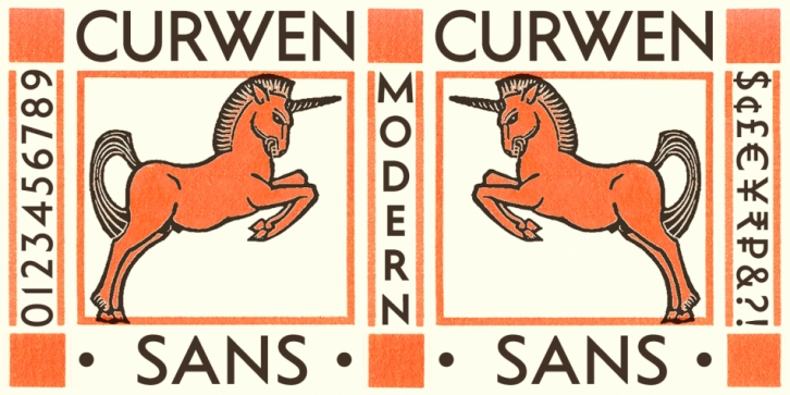

Curwen Sans is a monoline sans-serif dating from the early twentieth century. Though contemporary with Johnston’s Underground and Gill Sans, and emerging from the same artistic milieu, Curwen Sans was created solely for in-house use at the Curwen Press in London so never achieved a wide audience or recognition.
Harold Curwen studied lettering under Edward Johnston and Eric Gill at the Central School of Art and Crafts, and his typeface is described in Curwen Press publicity from the 1930s as a series “based on an alphabet designed back in 1912â€. His capital letters are strikingly modern, geometric monolines that share features with both Johnston’s Underground of 1916 and Gill Sans of 1928. Curwen opted for an overlapping W which was also present in versions of Johnston’s Underground until the late 1930s. He preferred vertical terminals for his curved letters, even the uppercase S, which was a similarly consistent feature of Gill Sans. Although the drawing of Curwen’s capitals might predate the two design classics, Curwen Sans capitals and numerals were not cut in metal type until 1928, and only in a Medium weight.
A lowercase with some uncomfortably congested characters was hastily added a few years later and owes much to Rudolf Koch’s Kabel of 1927 both in the design of some glyphs and in the very low x-height which was even smaller than another influence, Paul Renner’s Futura of 1927.
Curwen’s lowercase g derives from, and perhaps improves on, the idiosyncratic g of Kabel. His swan-necked lowercase s has a quirky yet elegant art deco slant that encourages words to glide along gracefully. His unclosed lowercase e is daringly different, possibly inspired by an experimental form Renner initially considered for Futura, and reminiscent of the ‘Village’ adaptation of Berthold Wolpe’s Albertus created for the 1960s TV show, The Prisoner.
Alterations and Alternates
K-Type’s Curwen Sans lavishes the lowercase with some long-overdue TLC. To better suit contemporary design requirements, small letters are redrawn bigger and the stroke weight is made slightly thinner relative to the capitals. Crucially, the x-height is increased, following the example of more recent versions of Kabel, thus decreasing stroke congestion and allowing uncomfortably narrow letters to be widened to improve compatibility and evenness of color; most notably, the larger a, c, e, and g achieve a better balance with other letters. Curwen’s top-heavy lowercase f is narrowed and benefits from a higher crossbar, as does the lowercase t.
The lowercase c has been altered to match the vertical terminals of Curwen’s uppercase C and also conform to the vertical endings on the e, a, s and S. The numerals 3, 5 and 7 are also given vertical terminals. These vertical terminals are similarly consistent in Gill Sans, whereas Johnson had considered and rejected them for his uppercase S even though his lowercase s featured vertical stroke endings. K-Type Curwen Sans makes vertical terminals the standard for new characters such the euro sign and even in the design of diacritical marks; like all recent K-Type releases, Curwen Sans now has a full repertoire of Latin Extended-A accented characters.
The original lettering may have been drawn with sharp pointed apices and vertices for the A, M, N, W, V, w, and v, but printed samples show rounded corners that bestow a softness and warmth. So, like the heavier weights of spiky geometrics such as Kabel and Futura, K-Type Curwen Sans truncates such pointy overshoots to avoid evoking any ‘sat-on-a-pin’ discomfort.
Curwen’s original zero was identical to the uppercase O, but the K-Type Curwen Sans zero is narrowed to better match the width of other numerals.
However, purists need not be alarmed by these changes; where characters have been altered, perhaps contentiously, versions more faithful to Curwen’s originals are included as alternates accessible with OpenType savvy software. Alternates include the unaltered lowercase c, Curwen’s more skewed number 5, the 3 and 7 with angled terminals, the wider circular zero, and the A, M, N, W, V, w and v with pointed apex and vertex overshoots.
Curwen’s strict monolinearity has been very slightly relaxed in the digital face to introduce a small degree of stroke contrast, so horizontal strokes are made a little thinner than verticals, and a modest narrowing of strokes is introduced at congested intersections.
K-Type Curwen Sans comprises three packages:
• The Basic Family of Regular and Bold, complete with new optically corrected Oblique and Bold Oblique fonts.
• The original Medium weight with a new optically corrected Medium Oblique.
• A new Light weight with a new optically corrected Light Oblique.
Thanks to Birmingham designers An Endless Supply (Harry Blackett and Robin Kirkham) for their research into Curwen Sans and the Curwen Press in their publication, ‘Curwen Sans Type Specimen’. Also to Mikey Ashworth for his photographs of Curwen Sans samples, and to Andrew Emmerson for suggesting the revival.
Font Family: