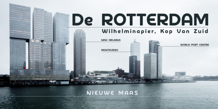

This font is a clean, modern sans serif bold. Named after “De Rotterdamâ€* this huge and super cool building (read the story below). Great for headlines, Posters, Flyers but also well legible at small size in large texts.
Contains All European language accents and characters.
—- The Story—-
*This complex is located in the Kop Van Zuid district of Rotterdam, on Wilhelminapier. I was lucky to see this building from the beginning (2009) growing up (2013) That time when I was working and living here. I was always amazed by the design and how huge it is every time I took a look at it while driving or walking on the Erasmus Bridge. When I was going to work or just hiking around the city. It has a special meaning and message for me: I started creating fonts in my free time in 2010 when I came to this city to work. I was a factory worker, dishwasher etc. I grew together with this amazing construction from brick to brick, step by step. By the time its construction finished, I was able to quit my day job and become a full-time freelance designer.
Font Family: De Rotterdam Regular