The Backstory Scoop
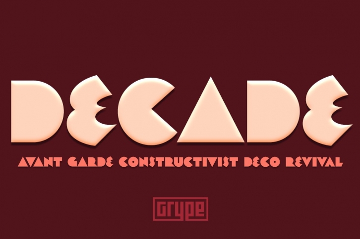
Straying outside of our usual logo driven typestyles, but remaining within typographic styles that have a strong brandable vibe to them comes our Decade font. Spawned from the 1938 book "Letters and Lettering" by Paul Carlyle and Guy Oring, this display style has been fleshed out into a full blown typeface, rich with a personality that evokes Art Deco and Jazz sensibility yet rooted in Russian Avant Garde Constructivism.
Decade has a constructivist feel, yet contains letterforms that take take its appeal to album covers, holiday cards, minimalist corporate branding, and beyond. It adopts a sturdy yet approachable style with its geometric forms and curves, creating a straightforward, powerful presence that creates a solid foundation for designers and design trends.
Here's what's included with the Decade typeface:
- 368 glyphs - including All Capitals, Numerals, Punctuation and an extensive character set that covers multilingual support of latin based languages. (see the 5th graphic for a preview of the characters included)
- Fonts are provided in TTF & OTF formats. The TTF format is the standard go to for most users, although the OTF and TTF function exactly the same.
Here's why Decade is right for you:
- You're in need of geometric typestyle evocative of the Jazz Era
- You love that Constructivist look, but are seeking something "different"
- You're looking for an Art Deco Showcard style typeface.
- You're looking for a typeface with letter minimalist styled geometry.
- You just like to collect quality fonts to add to your design arsenal
Share your work with me by sending me a message through Creative Market. We are currently working on our website and would love to feature designers work on our site and via social media when ready. Plus, we love to see our fonts get used in both traditional and unexpected ways!
File Types: OTF, TTF
File Size: 28.47 KB
Release date: August 28, 2019
You can use this font for:
- Design projects: create images or vector artwork, including logos
- Website publishing: create a Web Project to add any font from our service to your website
- PDFs: embed fonts in PDFs for viewing and printing
- Video and broadcast: use fonts to create in-house or commercial video content and more
- The fonts are designed to work on MacOS (Apple) and Windows (Microsoft)


