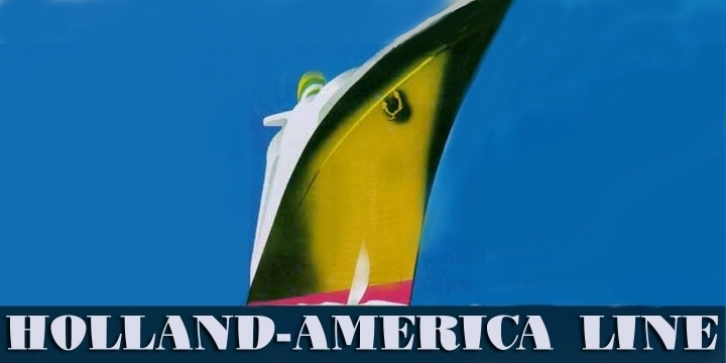

Deco Doni is a font with two conceptual inputs:
It derives inspiration from
1. The Didot/Bodoni style of font, with its dramatic contrast between thin and thick lines, and
2. The quirky, fun-filled look of many art deco fonts.
The name “Deco Doni†was derived from these two inputs: art DECO + boDONI.
Deco Doni doesn’t take itself seriously, yet is crafted with all the care of its antecedents.
The font has been carefully kerned and best results are obtained if kerning is switched on. However, even without kerning, the character shapes and spacing are very attractive.  All-caps passages work well and so you can use all-cap headlines. A number of (open-type) automatic ligatures are included to make the character spacing truly professional.
It is perfect for the creation of a retro feel in headings and subheads and also works extremely well as a text font in small sizes. Deco Doni Narrow has been especially designed so that the narrower parts of the characters do not become hard to read at small font sizes.
Font Family: