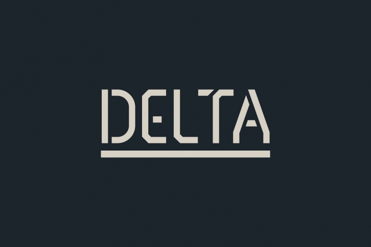

The best thing about this typeface was I had not intention of creating yet another stencil typeface. In fact the very early idea behind it was more SiFi and minimal. I was really intrigued by playing with negative space and trying to find unique was to abstract each letterform. Some of those early ideas can still be seen in this font, especially when you start noticing the placement of gaps in each letterform. In the end what I was left with was a very modern interruption of the classic stencil typeface. There’s a few letterform in Delta that I’m so proud of and I feel are very unique. The capital M and S are just badass, and the lowercase a and e where another two I was thrilled with. Not to mention the 9, 6, and 8 which I find very sexy.
