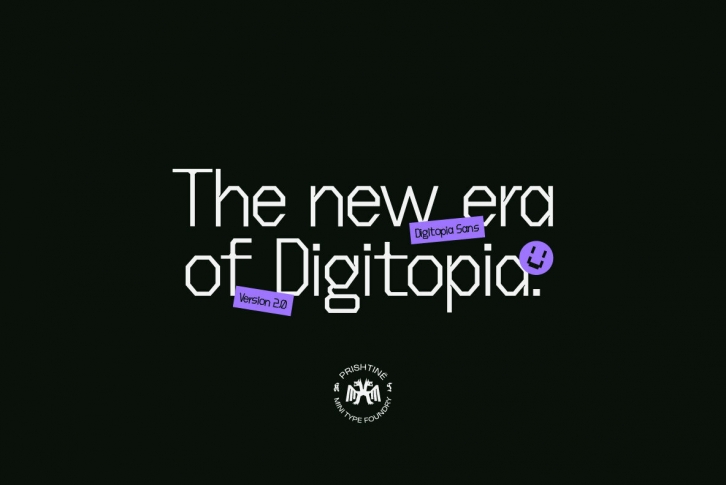

After more than 2 years since it has been released it was time to give the type a fresh new feel and rework it fully from scratch with the base still remaining similar.
We wanted the feel of Digitopia to remain the same, the type that it is known for or as we call it, a Traditional Digital Mashup.
The first version was filled with curves, especially at the terminals and serifs. We've now simplified it a lot and shifted it more towards a Sans feel. It still has the general curves and turns but the additional details have been adjusted.
Currently available in 1 weight & 2 styles.
