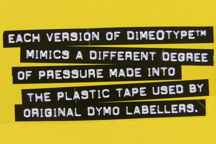
DimeOtypeâ„¢ is a font based on the impressions made into a plastic ribbon by the old labelling machines, commonly used throughout the 60s and 70s.
THIS IS THE CASE
You will discover that there are no lowercase letters in these fonts. Although some versions of the original labellers did imprint lowercase letters, most were only capable of producing uppercase characters. To give you more variety and alternate characters to choose from, each DimeOtypeâ„¢ font has TWO versions of the uppercase alphabet (i.e. although the "lowercase" character slots are filled with capital letters, they are all slightly different from their uppercase counterparts). Depending on the words you are setting, you may want to experiment with the different versions to see which combinations will give the most punch to your design.
WHICH VERSIONS DO WE RECOMMEND?
The original, and designer's personal favourite version of DimeOtypeâ„¢ is the Bold Lowercase. If you want a version that really appears to have that plastic reflective "shine", use the Regular Lowercase.
CREATING THE "TAPE" EFFECT?
For designers using Page Layout software such as QuarkXpress, InDesign or Illustrator, you can create the "tape" with custom widths and jagged edges by drawing boxes, and placing your DimeOtypeâ„¢ text on top, coloured in white. As the Regular DimeOtypeâ„¢ fonts all come with International Character sets, you can access all the characters using this technique and adjust the ribbon width to create a proper balance which will accomodate any accented characters.
For users who are using word processing software which may not allow them to produce these kind of effects, a special font called DimeOtypeâ„¢ Tape has also been included. It sets with clear characters on a ribbon background. Designers using Page Layout software may also want to use this version of the font for the purpose of creating a ribbon where the letterforms are transparent, allowing an underlying image to show through the letter parts of the ribbon.
ABOUT THE "DIMEOTYPEâ„¢ TAPE" FONT
(1) Because the ribbon width has been balanced to accommodate only non-accented characters, all of the accented characters and other special characters are missing from this version of the font. All the alphabetical characters, numbers and common punctuation are present, however. If you need other special characters, you will have to manually create your own ribbon using the technique described above, and using the other fonts.
(2) In the "Tape" version, the lowercase alphabetical characters are taken from DimeOtypeâ„¢ Regular while the uppercase letters come from DimeOtypeâ„¢ Bold.
(3) You will probably want to begin and end each line you set with a space character, otherwise the first and last letters on each line will appear to be "cut" too close to the edge of the tape. Occasionally, the "space" character does not display or print the blank tape. In such cases, just type ANY special character in its place. The reason the space character does not always work properly is because font software specifications were never set up to accomodate printable characters in what is supposed to be a blank character slot.
CREATIVE USES OF DIMEOTYPEâ„¢
As the original tape came out of the labeller in a long ribbon, multiple lines had to be stuck to a "sign" surface manually by the user. The common result was that the strips of tape were not always parallel. When using the DimeOtypeâ„¢ fonts, you might want to create that element of "realism" to your setting technique by typing each line separately and then randomly rotating them by a degree or two (changing the angles from line to line). If you want to be extra radical, you could rotate each line by several degrees and even overlap the lines in some spots.
COLOUR SELECTION
Most of the original labeller tape was either black, blue, red or dark green, with the resulting imprints showing up in white on the plastic. If you wish to modernize the colour scheme, you might even try colouring the the type, as long as you are careful to maintain a significant contrast between the type and the background ribbon colour.
COMPANION FACES
If you are looking for a companion family which is has more character dropouts and other impression flaws, check out our Label Gunâ„¢ fonts. You can license both families together at a reduced special rate.
FULL CHARACTER SET
Each font in the Dime-O-Typeâ„¢ family has a full character set of 232+ letterforms, with all characters designed in the style of the font.
File Size: 17.68 MB
Release date: March 3, 2013
You can use this font for:
- Design projects: create images or vector artwork, including logos
- Website publishing: create a Web Project to add any font from our service to your website
- PDFs: embed fonts in PDFs for viewing and printing
- Video and broadcast: use fonts to create in-house or commercial video content and more
- The fonts are designed to work on MacOS (Apple) and Windows (Microsoft)


