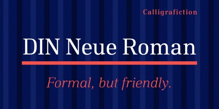
Designed by Philip Lammert, DIN Neue Roman is a serif font family. This typeface has fourteen styles and was published by Calligrafiction.
The DIN Neue Roman adds something new to the established concept of the DIN 1451 type’s technical origin. As a serif counterpart it leaves its static appeal to bring some friendliness into this industrial idea. With more contrast than a slab serif and the dynamic stroke of transitional type DIN Neue Roman defies all conventions, but keeps its legibility.
To have enough resources for diverse and complex typography this type family offers 7 weights with italics, small caps and all kind of opentype features.
Type designer Philip Lammert likes to play with the great potential of contradictions. That brought him to this design combining two essentially different classics. DIN Neue Roman is part of his 2015’s master thesis at the HAW Hamburg which was supervised by Prof. Jovica Veljovic.
Font Family:·
DIN Neue Roman Thin·
DIN Neue Roman Thin Italic·
DIN Neue Roman Ultra Light·
DIN Neue Roman Ultra Light Italic·
DIN Neue Roman Light·
DIN Neue Roman Light Italic·
DIN Neue Roman Regular·
DIN Neue Roman Italic·
DIN Neue Roman Medium·
DIN Neue Roman Medium Italic·
DIN Neue Roman Bold·
DIN Neue Roman Bold Italic·
DIN Neue Roman Black·
DIN Neue Roman Black ItalicFile Size: 11.64 MB
You can use this font for:
- Design projects: create images or vector artwork, including logos
- Website publishing: create a Web Project to add any font from our service to your website
- PDFs: embed fonts in PDFs for viewing and printing
- Video and broadcast: use fonts to create in-house or commercial video content and more
- The fonts are designed to work on MacOS (Apple) and Windows (Microsoft)
Preview:

