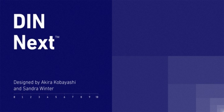

This classic design turned modern must-have includes seven weights that range from light to black, each of which has a complementary italic and condensed counterpart. The family also included four rounded designs, stretching the original concept's range and core usability. DIN Next also boasts a suite of small capitals, old style figures, subscript, superscript and several alternate characters.
A quintessential 20th-century design, its predecessor DIN was based on geometric shapes and was intended for use on traffic signs and technical documentation. Akira Kobayashi's update made slight changes to the design, rounding the formerly squared-off corner angles to humanize the family. Rooted in over 100-years of history, it's safe to say that there will always be a demand for the DIN design, and thanks to DIN Next, now it's as usable as it is desired.
Wondering what will pair with it perfectly? Check out Agmena, Bembo® Book, Cardamon, Joanna® Nova, FF Quadraat® and Quitador.
Font Family:
· DIN Next Pro UltraLight
· DIN Next Pro UltraLight Italic
· DIN Next Pro Light
· DIN Next Pro Light Italic
· DIN Next Pro Regular
· DIN Next Pro Italic
· DIN Next Pro Medium
· DIN Next Pro Medium Italic
· DIN Next Pro Bold
· DIN Next Pro Bold Italic
· DIN Next Pro Heavy
· DIN Next Pro Heavy Italic
· DIN Next Pro Black
· DIN Next Pro Black Italic
· DIN Next Pro Condensed UltraLight
· DIN Next Pro Condensed UltraLight Italic
· DIN Next Pro Condensed Light
· DIN Next Pro Condensed Light Italic
· DIN Next Pro Condensed
· DIN Next Pro Condensed Italic
· DIN Next Pro Condensed Medium
· DIN Next Pro Condensed Medium Italic
· DIN Next Pro Condensed Bold
· DIN Next Pro Condensed Bold Italic
· DIN Next Pro Condensed Heavy
· DIN Next Pro Condensed Heavy Italic
· DIN Next Pro Condensed Black
· DIN Next Pro Condensed Black Italic
File Size: 12.92 MB
