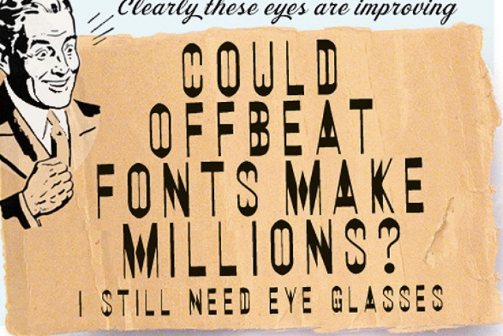
When using Double Vision™, if you are setting an "E" or an "e" followed by an "o" (or other circular characters "c", "g", "q" and "s"), there is a special version of the "e" which can only be found in the "ê" (E and e-circumflex) character slots. In these versions, the ends of the upper and lower crossbars on the "e" have curved extensions rather than the square ones found on all the other versions of the "e". These curved extensions replicate the way the "double vision" effect should actually look when the "e" is followed by any of the circular letters. Simply set the e-acute in place of the regular "e", in such cases, and then block out the accent portion of the character. You can also do this for an "F" or an "f" followed by a circular character, by also blocking out the bottom part of the "e". Although the results of your efforts will be subtle, it will really add an extra touch to your set type, especially if you are working at large point sizes.
To achieve the E and e-circumflex characters, Mac users type "option-i" and then the upper or the lowercase "e". PC users type "alt-0234" or "alt-0202".
WHEN A "SQUARE" MEETS A "CIRCLE"
If you are really into maximizing the effectiveness of your typesetting with Double Visionâ„¢, there are some other letter combinations you can watch out for. For the purposes of this explanation, the "square" letters being referred to are the characters which have a solid vertical sliver going down the right hand side (i.e. the H, h, I, i, M, m, N, n, and sometimes the J, j, U, u, plus some special characters too). Whenever you set these square letters and they are followed by the circular letters (described above), the proper replication of the "double vision" visual effect would be to change the square sliver into a circular one (i.e. the circular sliver to the left of the capital circular characters should REPLACE the sqaure sliver to the right of the square characters. Although it will make your typesetting job a little more time-consuming, this effect can be achieved by blocking out the square sliver and setting a capital circular character beside it, which you will have to kern to bring it overtop of the blocked out portion of the square letter. (e.g. if you are setting the word "hope", you would actually type "hOpe", and then block off the sliver to the right of the "h" and tighten the kerning between the "h" and the "O" so that the left sliver of the "O" appears to be the right sliver of the "h"). Once again, the final effect is subtle, but may be well worth your efforts.
A-TRICKS
When the upper or lowercase "V" and "W" are followed by the letter "a", you might find that replacing the "a" with the capital "A" will make the text look better. Even though we have made an optical adjustment and added kerning pairs, there appears to be extra space with these character combinations which is pleasingly filled by the sliver to the left of the capital "A".
INTERESTING OVERLAY EFFECTS
You can adjust the colour or shade of the slits, by using the Double Visionâ„¢ fonts in conjunction with the companion family Eye Doctorâ„¢. The companion family is identical in terms of its kerning and spacing, but has all the slits removed. If you set some text in Double Visionâ„¢ and colour it 30% black (for example), you can then place a copy of the text directly on top, and colour it 100% black and change the font to Eye Doctorâ„¢. Using this technique you can completely control the contrast of the 'blur" in relation to the body of the characters.
ABOUT IMPERFECTIONS
The imperfections in some of the Double Visionâ„¢ characters (such as uneven curves, rounded or chipped corners, off-axis angles, and slight baseline shifts) ARE all intentional. The objective of the font was not only to create the interesting "double vision" effect, but also to maintain a "done by hand" quality. If we had made the characters too even and consistant, a certain dynamic would have been lost.
COMPANION FACES
A version of Double Visionâ„¢ which has the blur slits removed is called Eye Doctorâ„¢.
FULL CHARACTER SET
Each font in the Double Visionâ„¢ family has a full character set of 232+ letterforms, with all characters designed in the style of the font.
File Size: 5.97 MB
Release date: October 11, 2012
You can use this font for:
- Design projects: create images or vector artwork, including logos
- Website publishing: create a Web Project to add any font from our service to your website
- PDFs: embed fonts in PDFs for viewing and printing
- Video and broadcast: use fonts to create in-house or commercial video content and more
- The fonts are designed to work on MacOS (Apple) and Windows (Microsoft)


