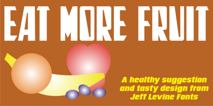
Eat More Fruit JNL was designed by Jeff Levine and published by Jeff Levine. Eat More Fruit JNL contains 1 style.
Eat More Fruit JNL is an odd name for a typeface, but then again the lettering style of the font is just as unusual.
Named for a 1940s-era poster espousing 'Put more pep in your step... eat more fruit', the lettering (although Art Deco in nature) also evokes images of 1960s and 1970s hippie-era concert posters.
Font Family: Eat More Fruit JNL
File Size: 21.44 MB
Tags: 1940s, art deco,
bold,
decorative,
display,
headline,
novelty,
quirky,
retro, sans serif,
unusual,
vintageRelease date: July 27, 2016
You can use this font for:
- Design projects: create images or vector artwork, including logos
- Website publishing: create a Web Project to add any font from our service to your website
- PDFs: embed fonts in PDFs for viewing and printing
- Video and broadcast: use fonts to create in-house or commercial video content and more
- The fonts are designed to work on MacOS (Apple) and Windows (Microsoft)
Preview:

