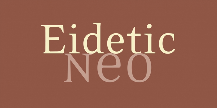

Cavazos drew Eidetic as a way of coming to terms with traditional typography (certain aspects of it, anyway) that he’d learned to hate as a production artist, burnishing tool in hand, in the 1980s. He’d initially intended to meet classicism halfway, but the exploration proved to be too compelling and he quickly crossed that line, and then many others.
The design itself was born in 1996 under what the designer considers ideal circumstances: scratched out on grid paper with an old mechanical pencil, from the passenger seat of a parked car (somewhere near 20th and Valencia, in this case). The original sketch was considerably more eccentric – a sign of its times – with a mixed serif treatment, and quirky bits throughout. Much of this evaporated during the development that followed, and ultimately a sans serif variant was spun off which allowed Cavazos to focus more intently on functionality and cohesiveness. Cavazos self-published the design as Eidetic Serif in February 1998; then in the spring/summer of 2000, in collaboration with Zuzana Licko, he rebuilt the five base fonts, and added the Black, Omni, and Fractions. Though visually similar to the previous edition, Eidetic Neo represents a magnitude of improvement – from point structure through to hinting.
Eidetic, the adjective, refers to a mental image of overwhelming vividness or clarity. As such, it can safely be said that the name does not apply to the experience of developing Eidetic. That process, according to Cavazos, was more of an iterative blur. Certainly, there are memorable milestones and revelations along the way, but the name is mostly dedicated to certain signature letterforms that link the original vision of the design to this final incarnation.
Font Family: