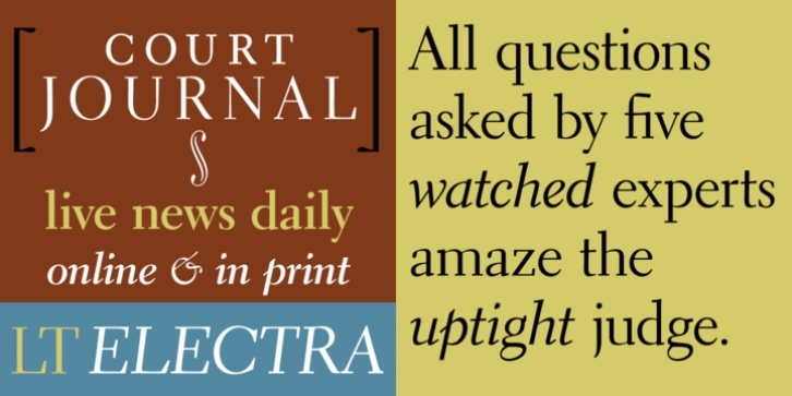
Designed in 1935 by William Addison Dwiggins, Electra has been a standard book typeface since its release because of its evenness of design and high legibility.
In the specimen book for Electra, Dwiggins himself points out the type'’s identifying characteristics:" “The weighted top serifs of the straight letters of the lower case: that is a thing that occurs when you are making formal letters with a pen, writing quickly. And the flat way the curves get away from the straight stems: that is a speed product.”"
Electra is not only a fine text face but is equally responsive when set at display sizes, realizing Dwiggins'’ intent when he set about the design: “"...if you don't get your type warm it will be just a smooth, commonplace, third-rate piece of good machine technique, no use at all for setting down warm human ideas, just a box full of rivets....I'’d like to make it warm, so full of blood and personality that it would jump at you.”"
File Size: 4.22 MB
Tags: 20th-century, book, book text, elegant, formal, m-formula, mid-century, optical sizes, personal text, serif, square serif, text, transitional
Release date: December 2, 2007
You can use this font for:
- Design projects: create images or vector artwork, including logos
- Website publishing: create a Web Project to add any font from our service to your website
- PDFs: embed fonts in PDFs for viewing and printing
- Video and broadcast: use fonts to create in-house or commercial video content and more
- The fonts are designed to work on MacOS (Apple) and Windows (Microsoft)
Preview:

