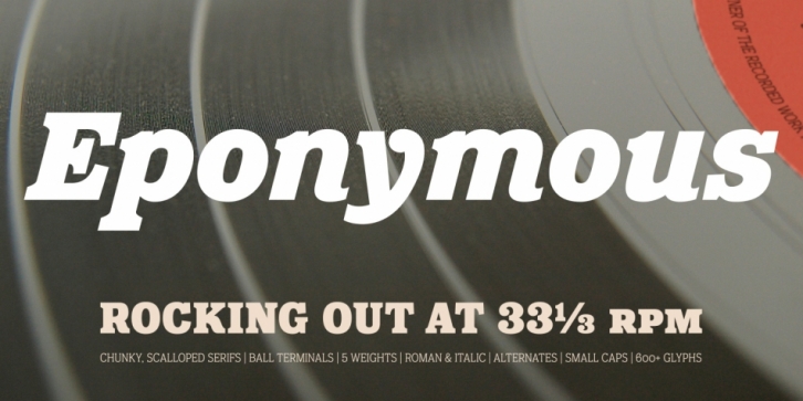

Eponymous is my fifth font release – it is an Egyptian-style typeface with chunky, scalloped serifs. It is available in five weights in both roman and italic.
I have always loved slab serif type and have often offered logo design options to my clients created with New Century Schoolbook or Clarendon, but more often than not, those designs were never chosen. Undeterred, I am trusting my own judgement and have created Eponymous to fulfil a yearning for a versatile, stylish and contemporary slab face. A key design characteristic is the implementation of scalloped serifs which, to me, imbues the font with a distinctive personality.
Make use of the Open Type features that are part of Eponymous. For a start, you can implement some stylistic alternates, so, if the main characters don’t quite suit your concept, try activating Stylistic Set 1. There’s also a full set of small caps included. You can mix and match these characters with regular lowercase to create some interesting unicase typography. Of course, all characters have complementing diacritics, enabling multi-language support.
Key features:
• Eponymous is is an Egyptian-style typeface with chunky, scalloped serifs
• 5 weights in roman and italic:
• Light | Regular | Medium | Bold | Black
• Full set of small caps with diacritics and figures
• 30+ alternate characters
• Full European character set
• 600 glyphs per font
